Case studyBrand Identity, 2026
Overview
Hive Armor protects honey bee colonies. I rebuilt its brand from a blank page: a new mark, colour, type and a 60-page book that keeps every touchpoint consistent.
- ClientHive Armor BioScience USA, bee-health research for commercial beekeeping
- My roleConcept, logo, colour, type, graphic language, templates and guidelines
- Worked withThe CEO, from first sketch to sign-off
- 60Brand book pages
- 9Colours, RGB, CMYK and Pantone
- 3Symbol cuts, sharp from 16 px
- 2Lockups in four colour versions
01 / Before and after
The old logo put a shield next to a bee. The new mark merges them: the A of Armor is the shield, and the bee lives inside it.


02 / The idea
Armor in the letter. The hive in gold.
The colony is what the company protects, so the bee is the only thing that is ever gold.
03 / The logo
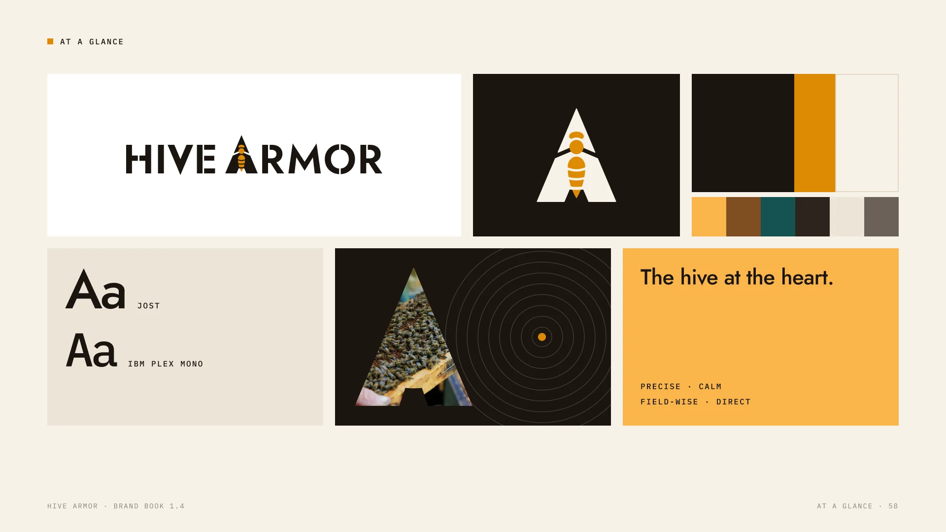
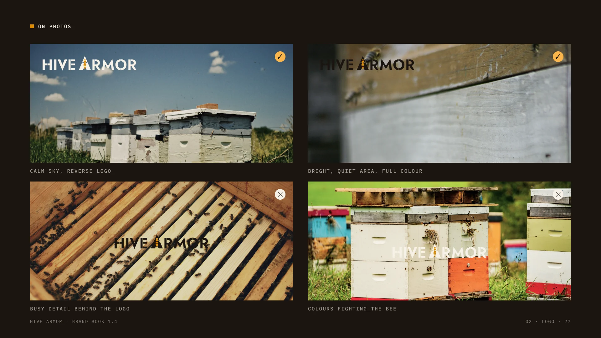
Two lockups for every space, on six approved grounds. The bee stays Amber on all of them.
04 / Built on one unit
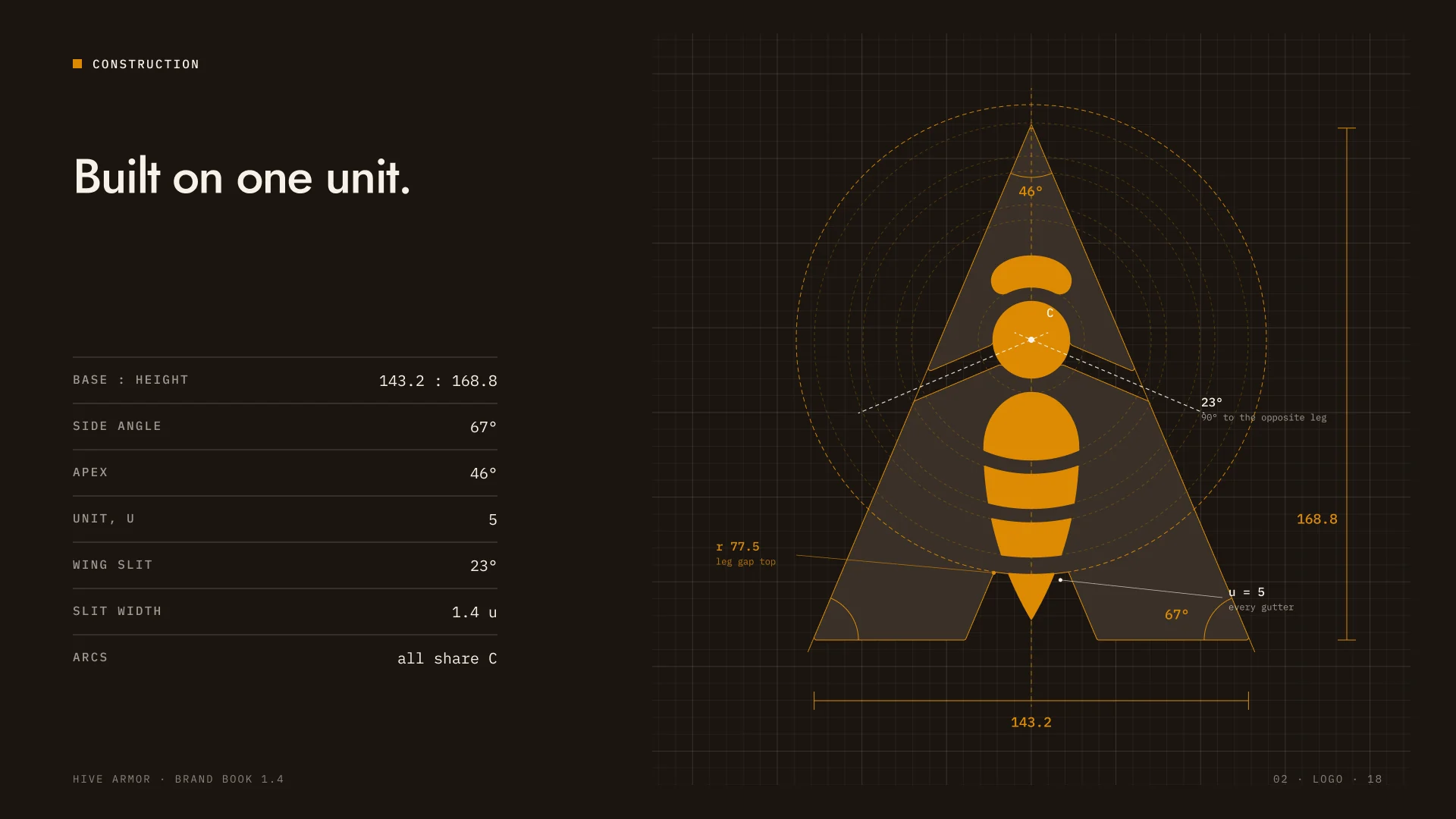
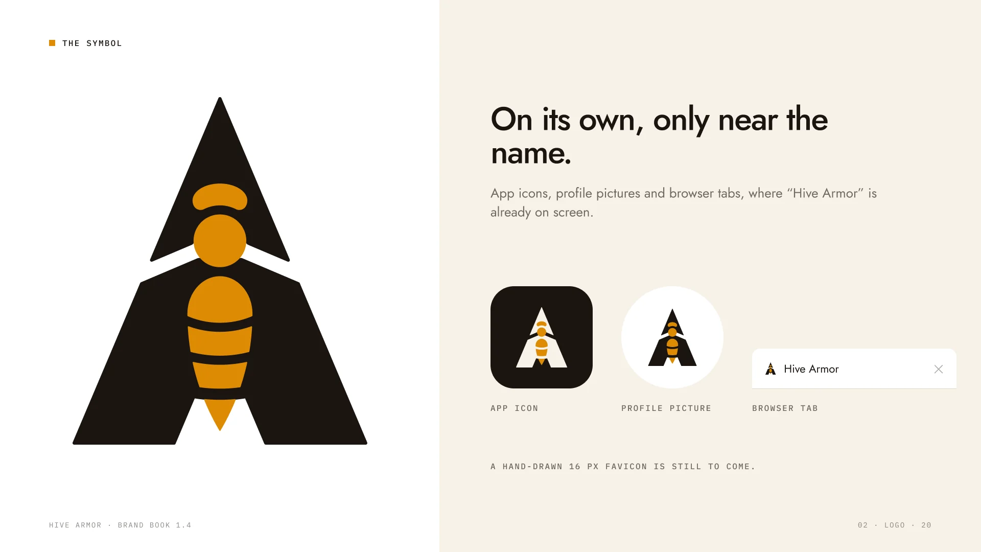
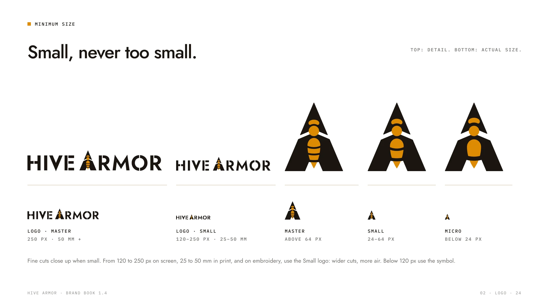
Every angle and gap comes from one unit. Three symbol cuts keep the mark sharp from a 16 px browser tab to a trade-show wall.
05 / Colour and type
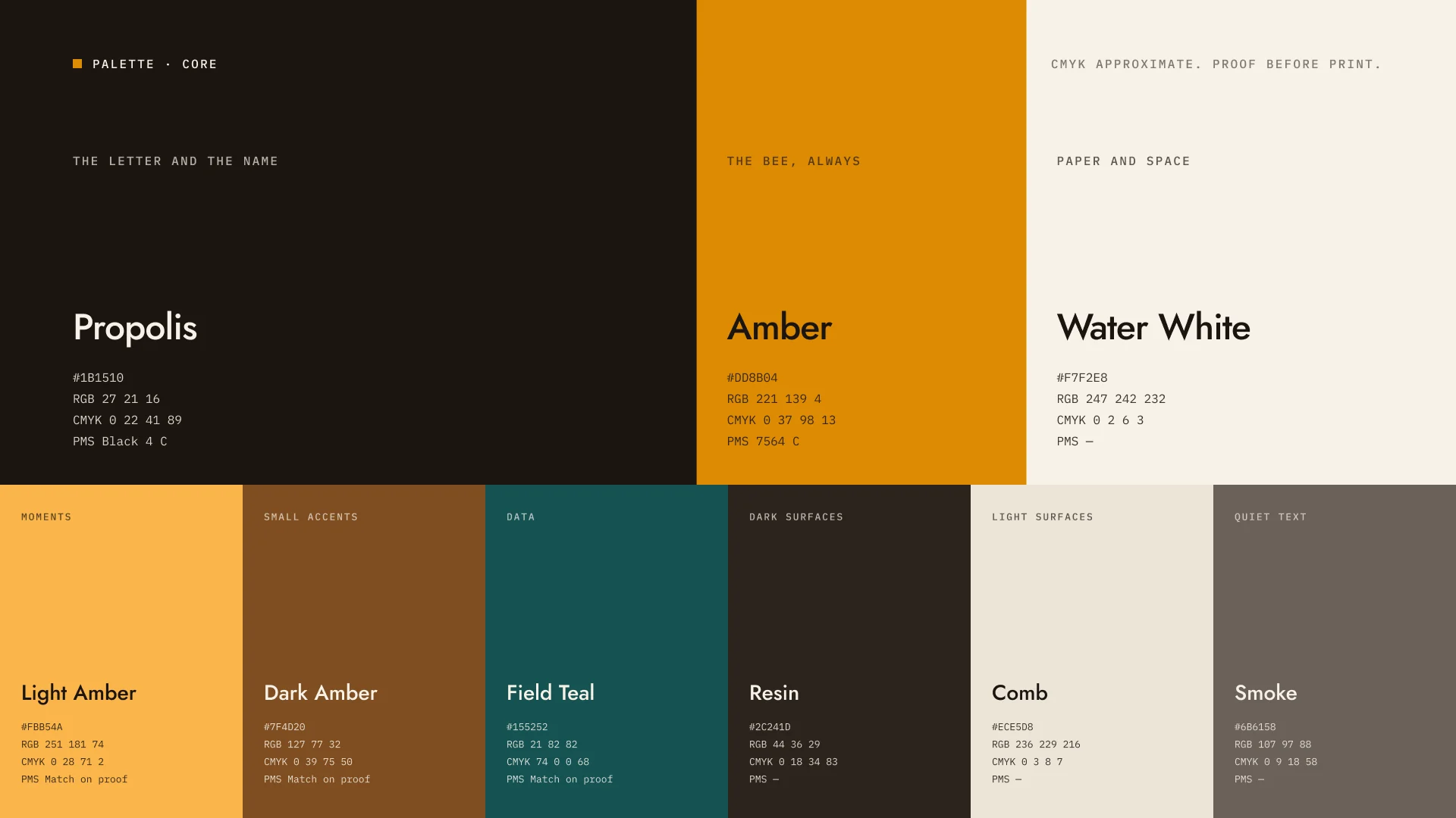
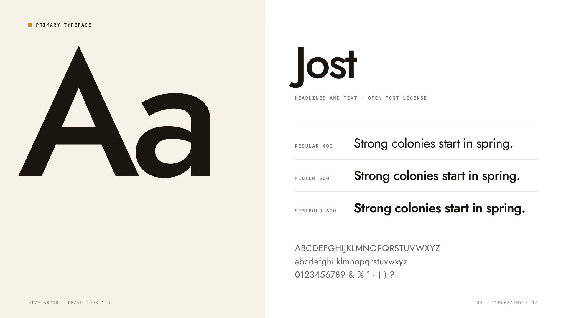
Three core colours carry the brand, six more handle data, print and quiet text. Jost speaks for the brand, IBM Plex Mono for the science.
06 / A graphic language
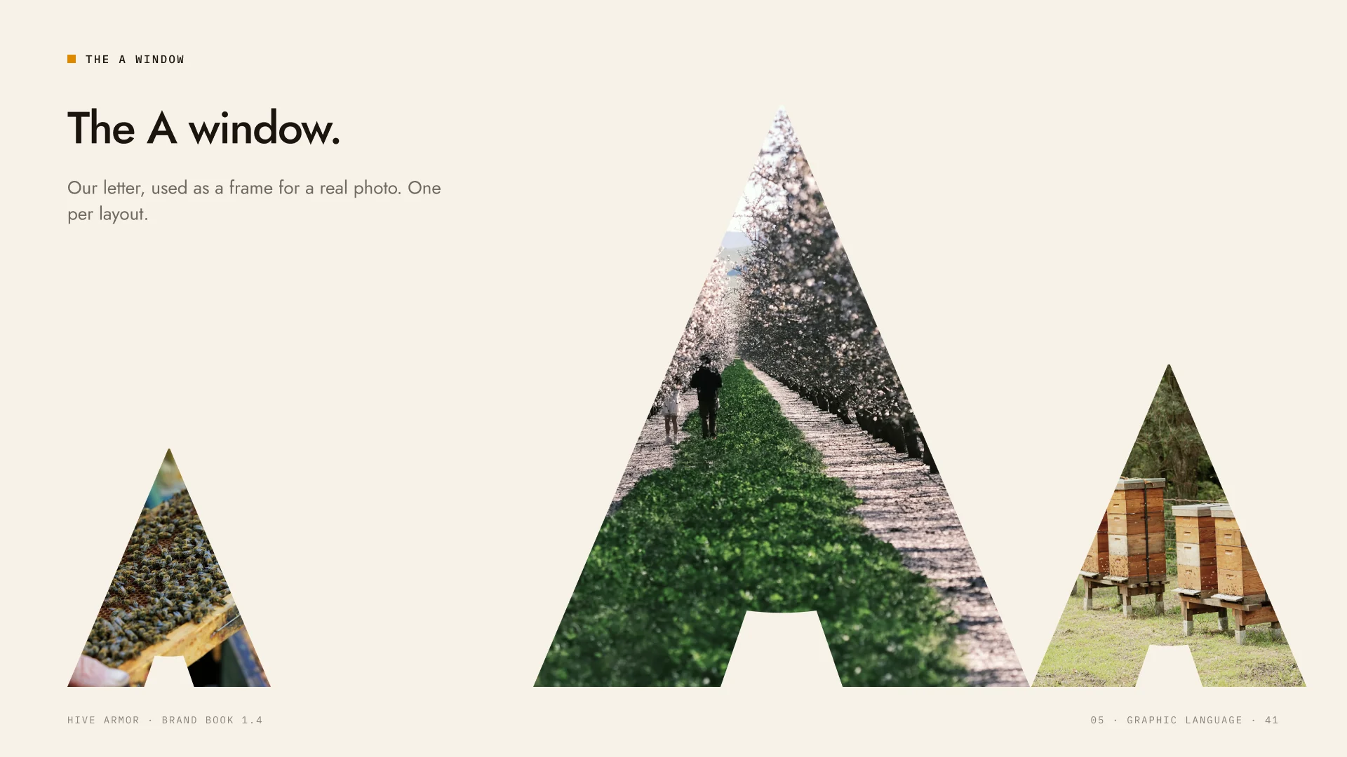
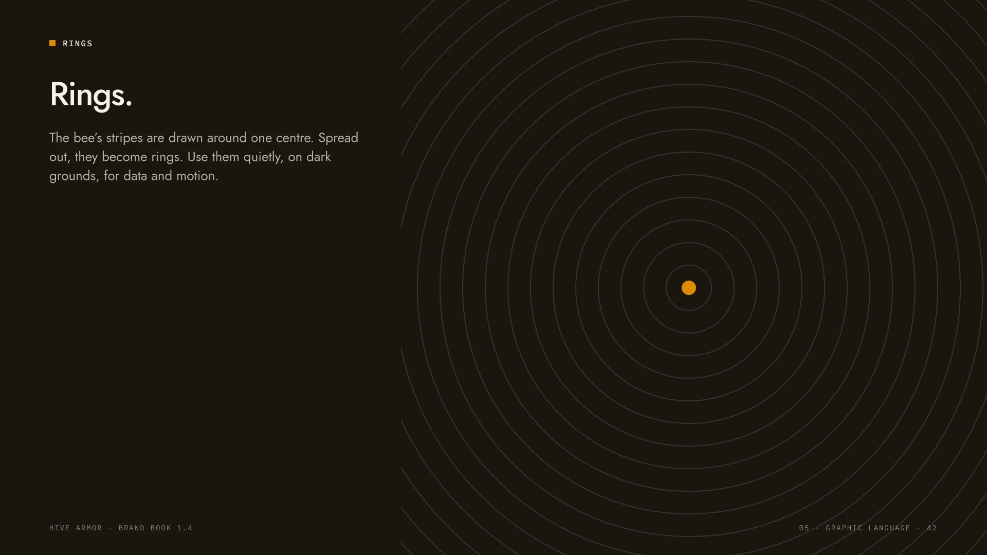
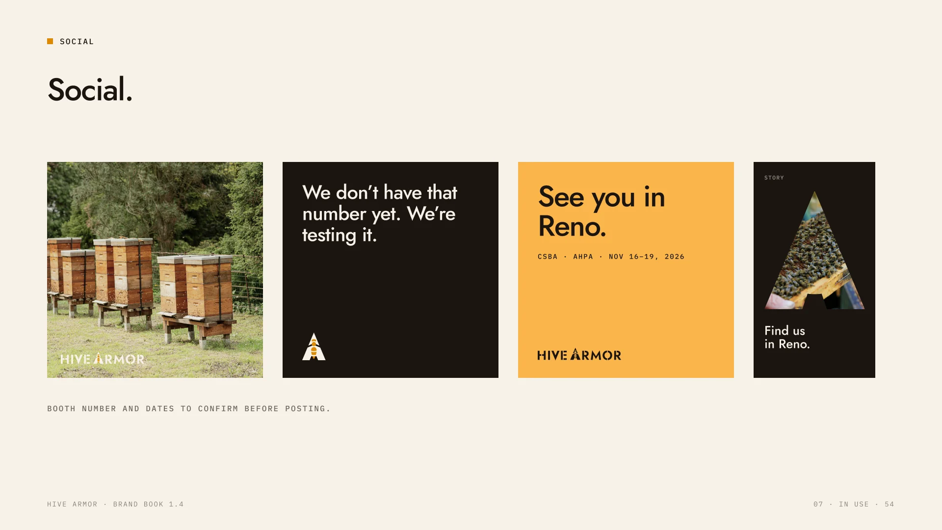
The A becomes a window for real field photos. The bee's stripes spread into rings for data and motion.
07 / Stationery
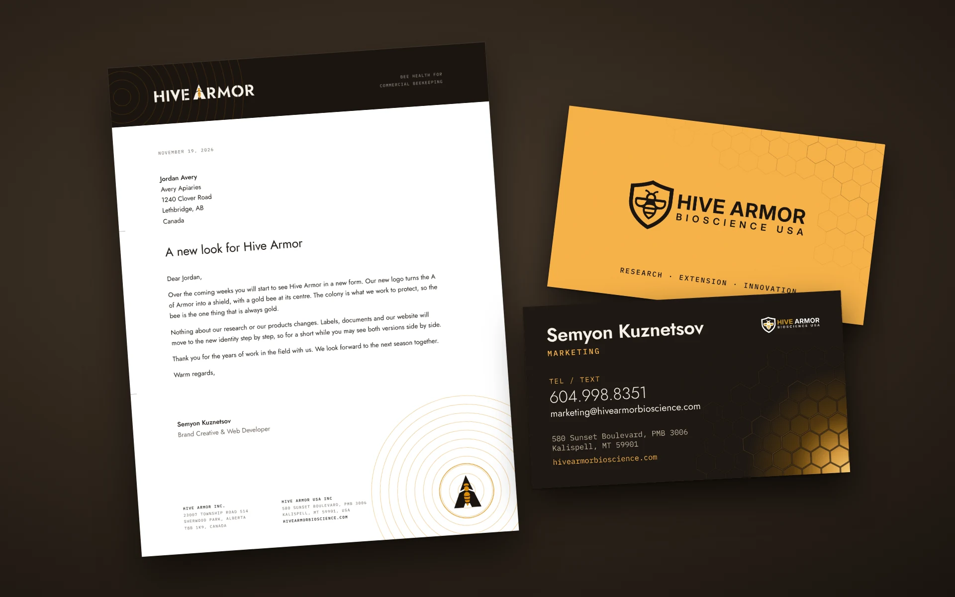
Letterhead and business cards for the team, set in the same palette and type as the book.
08 / Merch
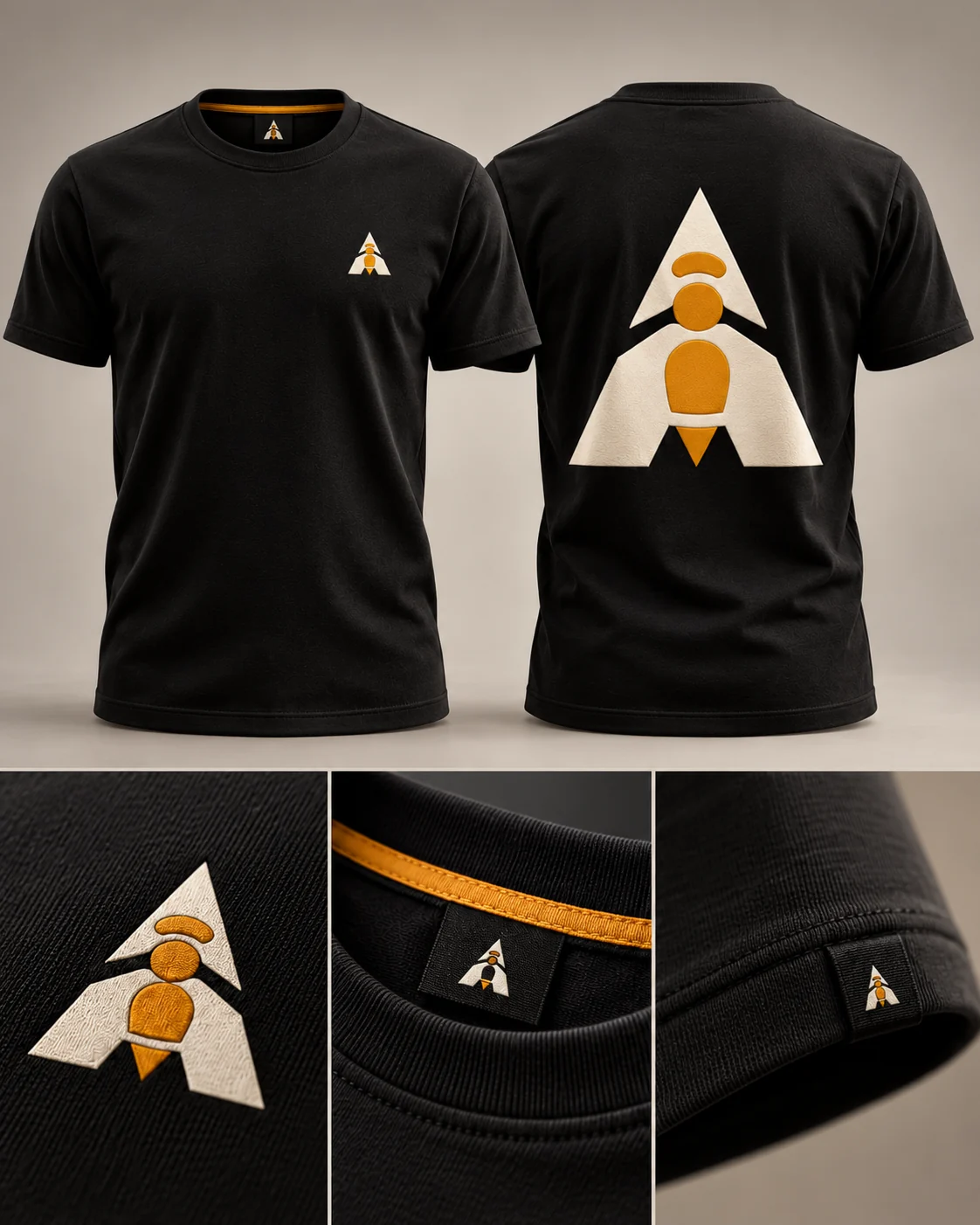
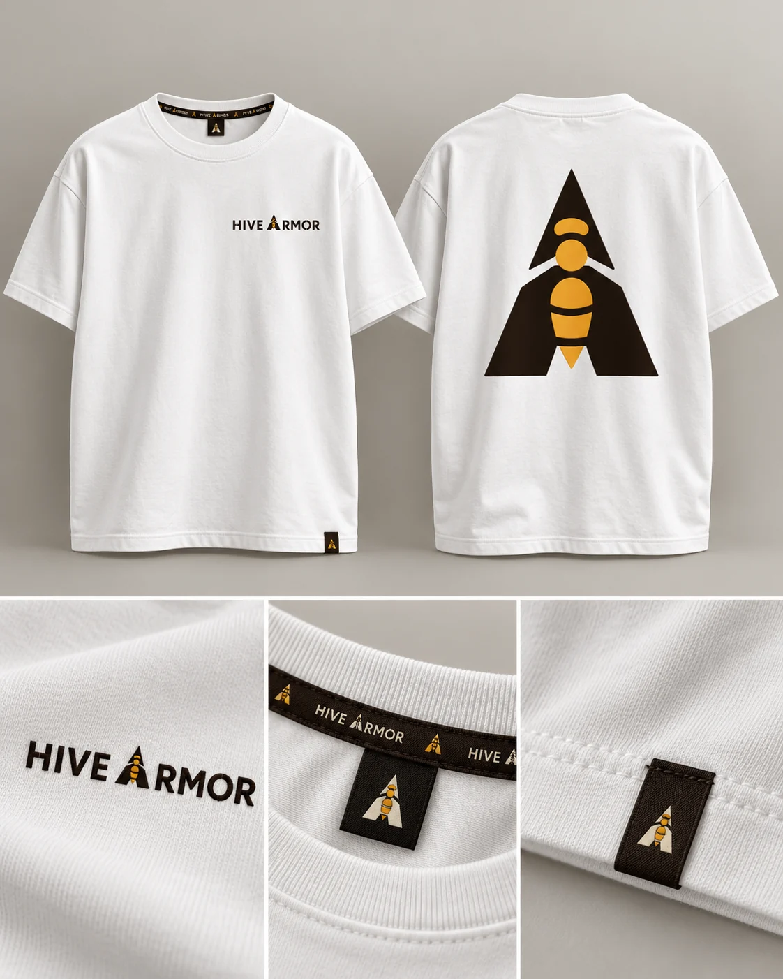
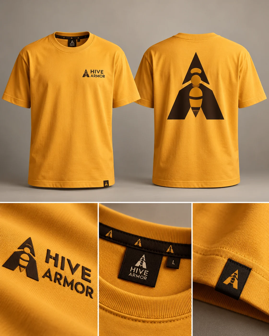
The mark had to work on fabric too: printed, embossed, tone on tone and woven into labels, on six grounds from the palette.
09 / The book
A 60-page brand book, so the identity holds up when I am not in the room.
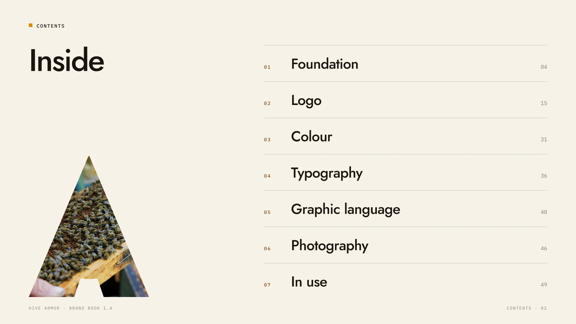
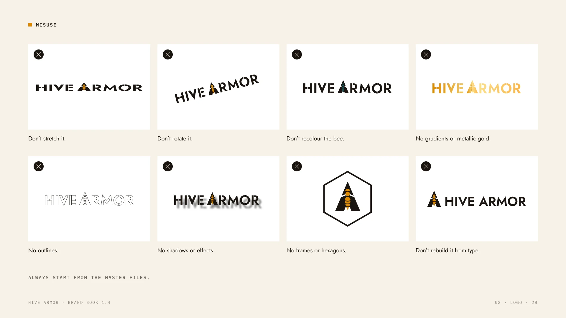
Foundation, logo, colour, type, graphics, photography and use, with clear rules for what not to do.