: NFC focus app for iOS, mobile UX/UI case study
Case studyMobile app UX/UI, 2025
Overview
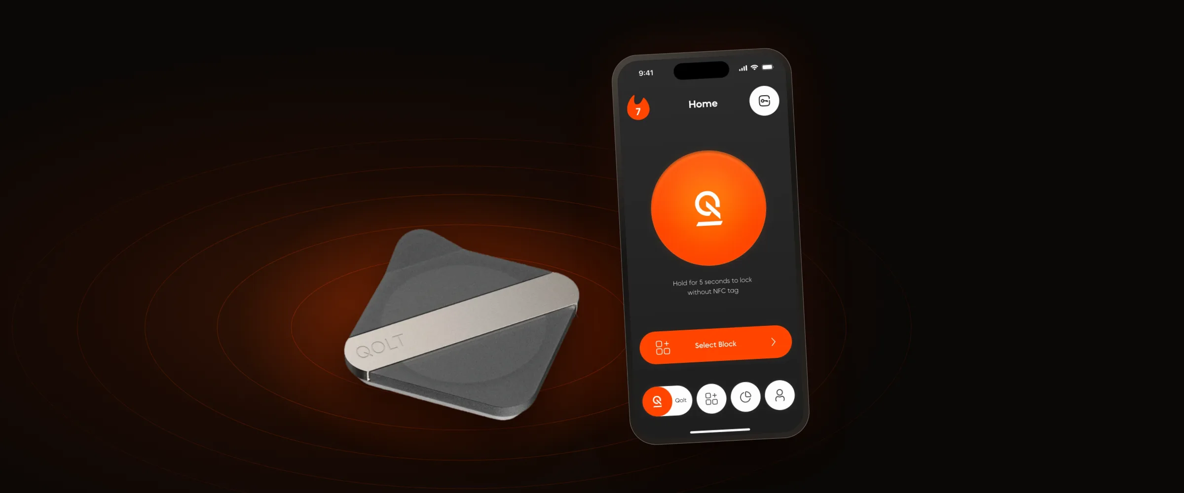
Screen-time apps fail because the off switch is one tap away. QOLT moves it into the room: you lock distracting apps by tapping your phone on a small NFC tag, and the way back means walking over to it. I designed this focus app end to end, from user research and UX to the UI and design system.
- ClientQOLT Tech Inc., a focus product that pairs an iOS app with an NFC tag
- My roleUX/UI Designer. Research, flows, interface, design system, landing page
- TimelineMarch 2025 to March 2026
- DeliveredThe iOS app in two themes, a component library and a landing page
- 17In-depth interviews, ages 20 to 32
- 4h 37mDaily screen time, on average
- 58Unlocks a day
- 50+ minDeep work lost every day
01 / The problem
Willpower was never the bottleneck. Friction was.
People switched software timers off within minutes. Each unplanned check cost two to five minutes of focus.
- PersonaIvan, 24, research assistant in a molecular biology lab
- 7:45Wakes up, reaches for the phone
- 7:47Morning scroll, fifteen minutes gone
- 8:00The guilt moment
- 8:07Rushes to the lab, already behind
02 / The idea
Put a physical step between you and your apps. Locking takes one tap. Unlocking takes a walk.
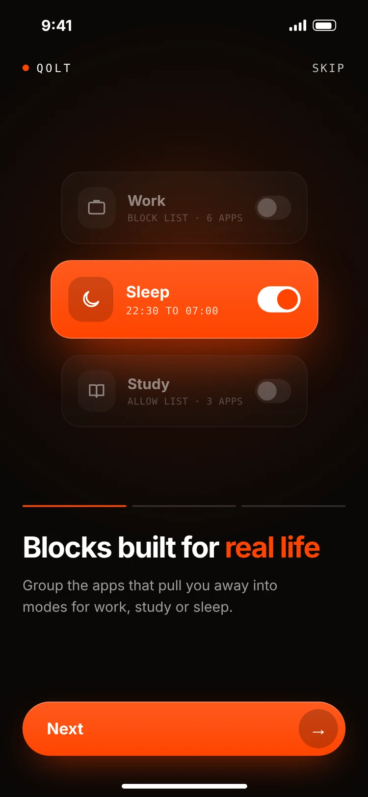
Group the apps that pull you away, for work, study or sleep.
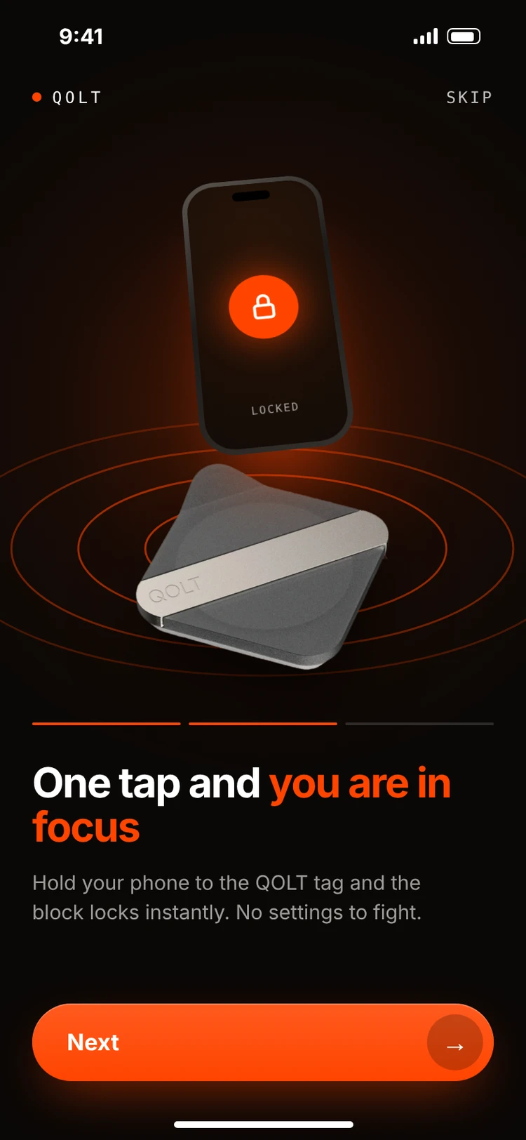
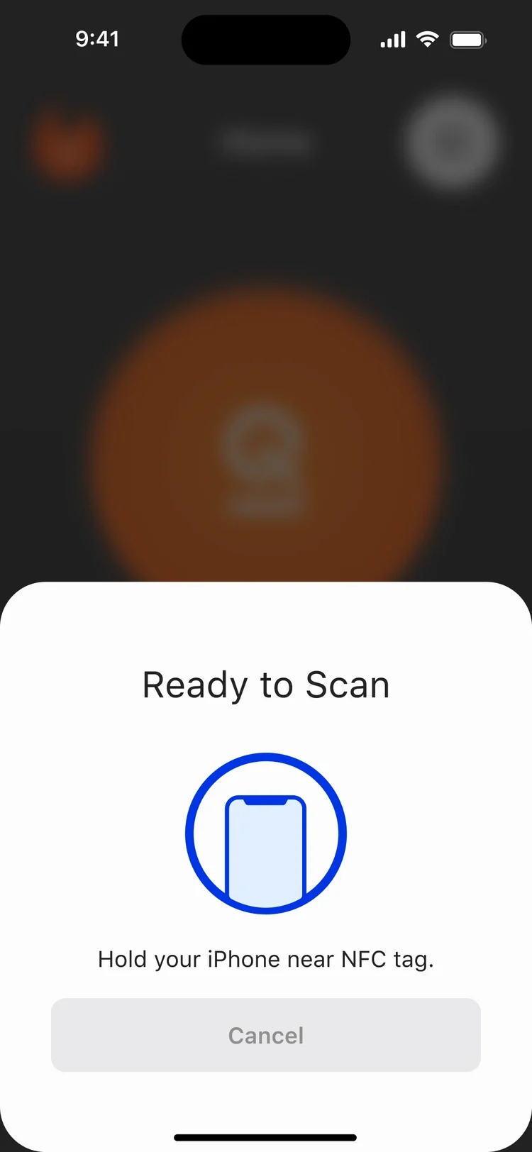
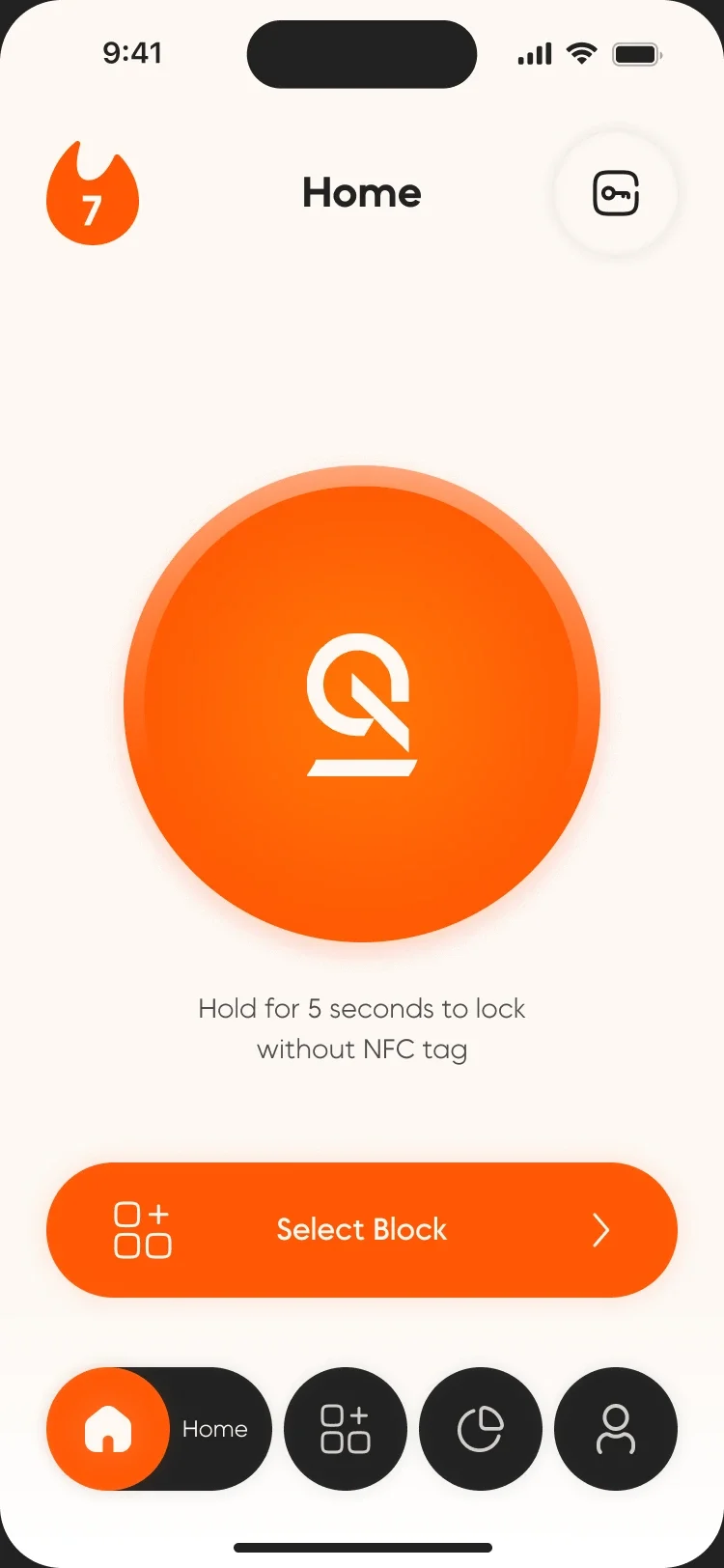
Hold the phone to the QOLT tag and the block locks.
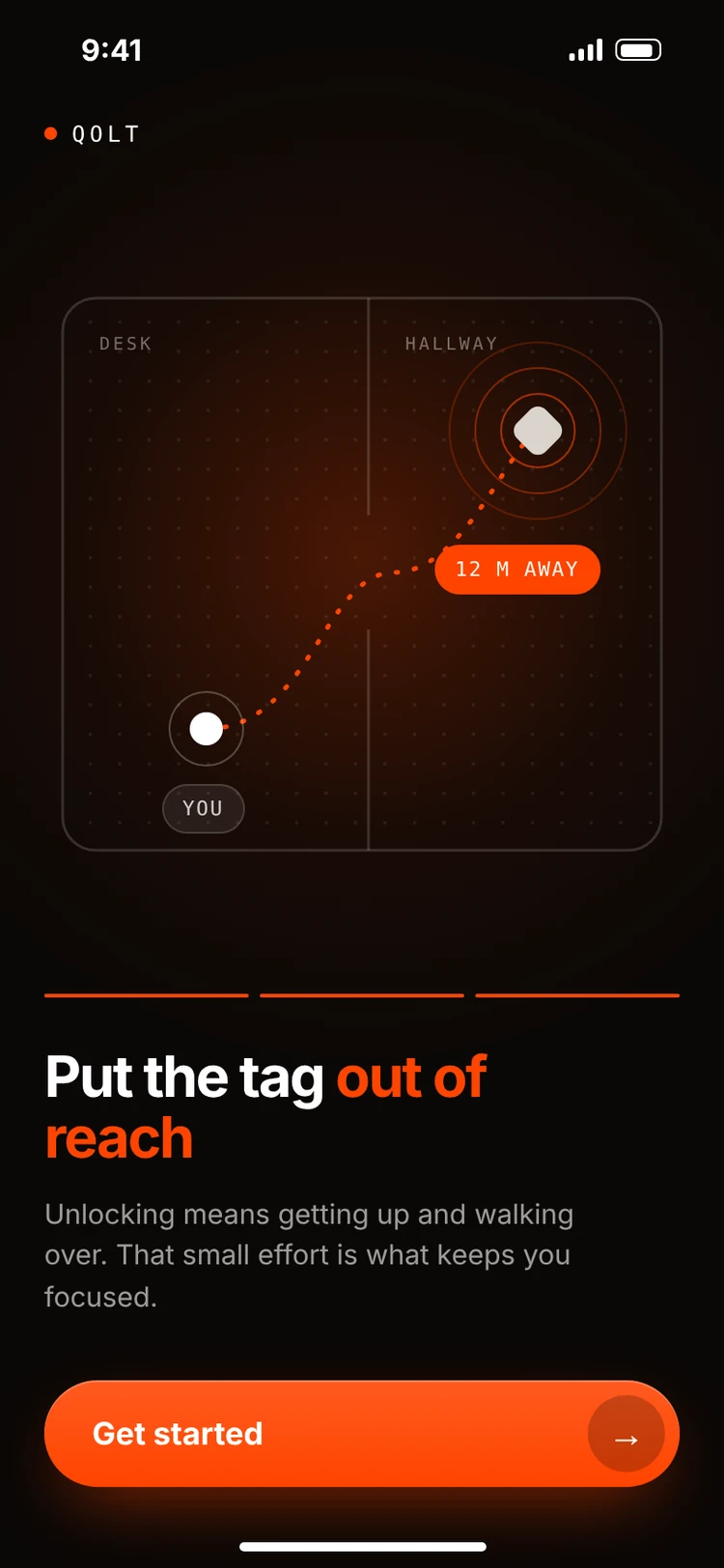
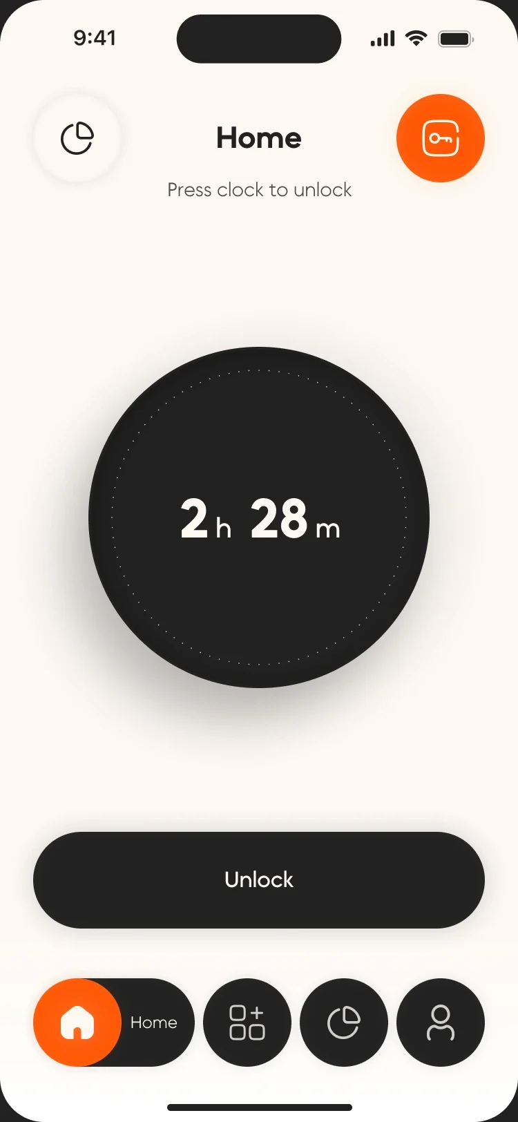
Leave the tag in another room. Getting back in has a cost.
03 / The core loop
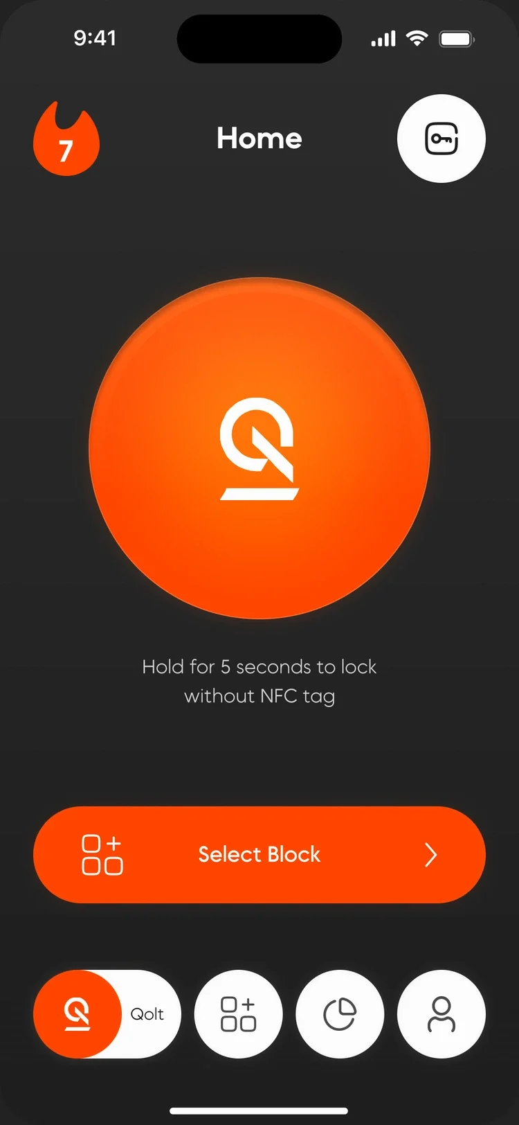
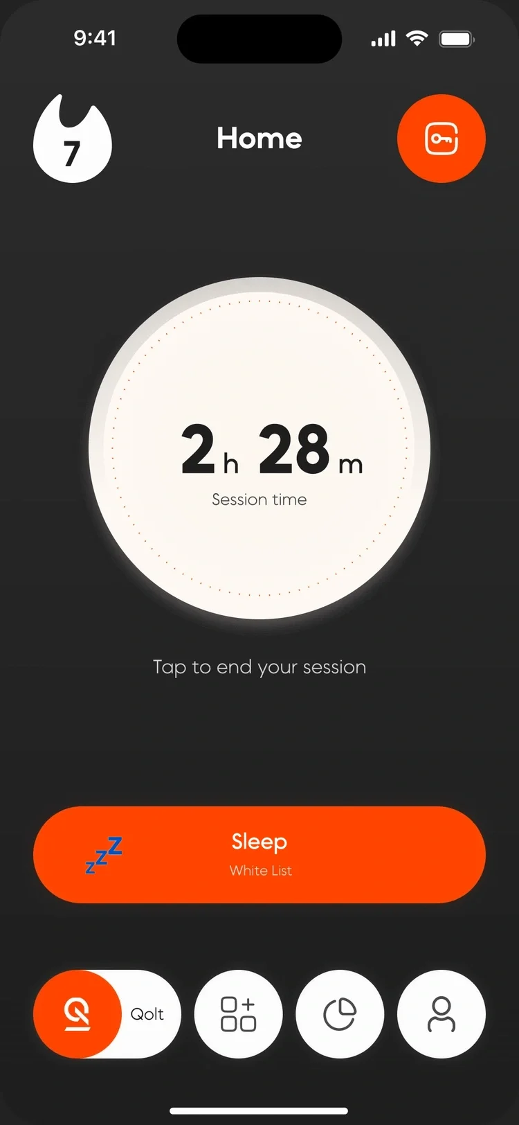
Three taps from distraction to focus, and a timer that shows what you gained.
No tag nearby? Hold the button for five seconds. Truly stuck? One emergency unlock a day, no more.
04 / Blocks
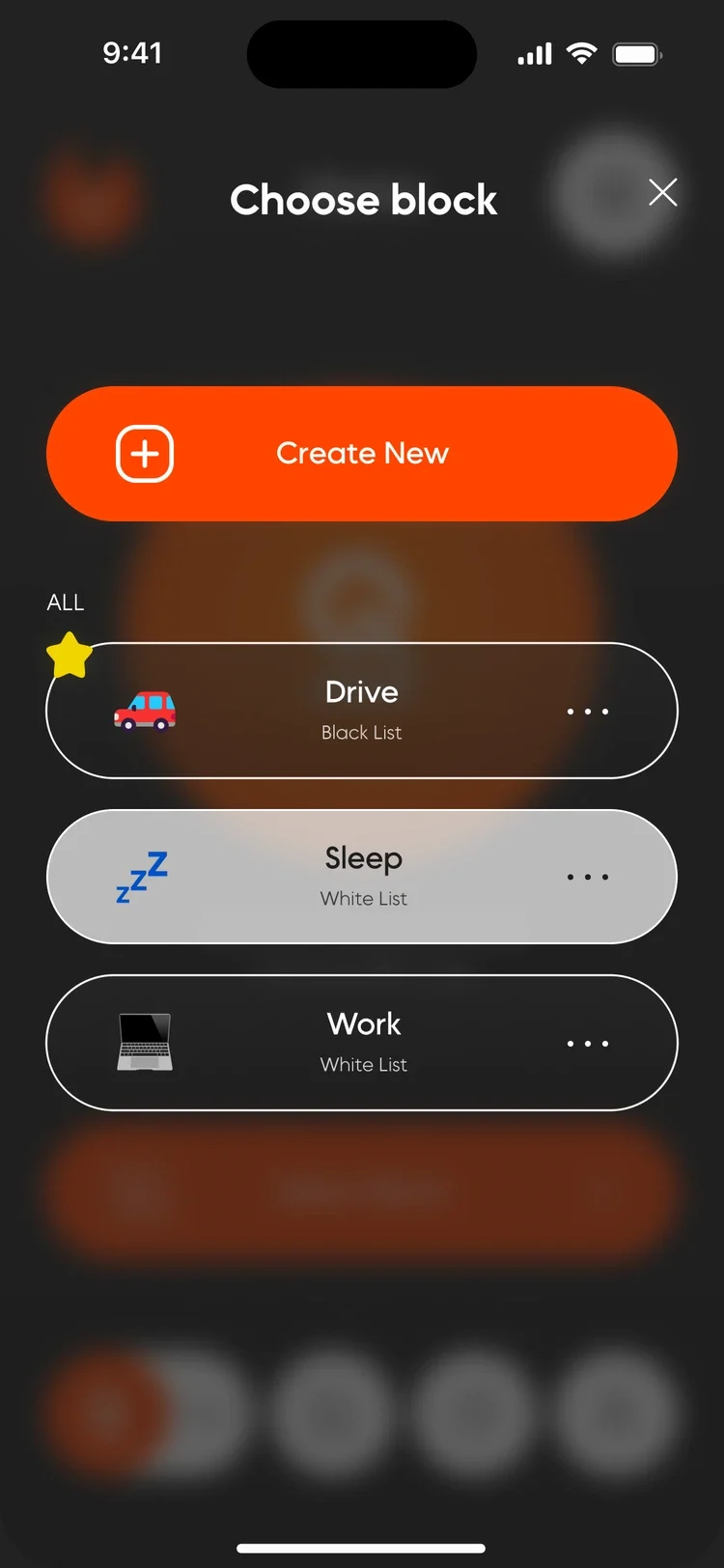
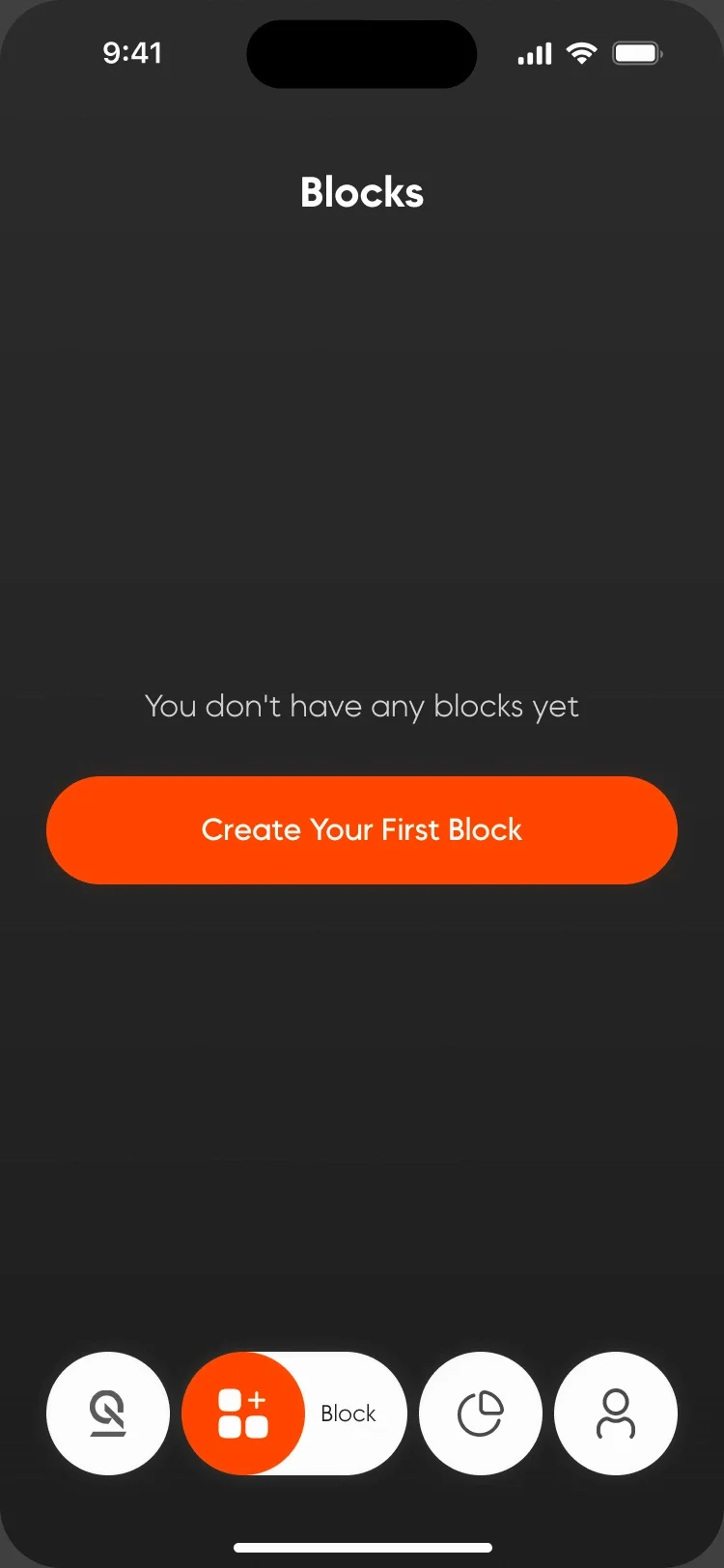
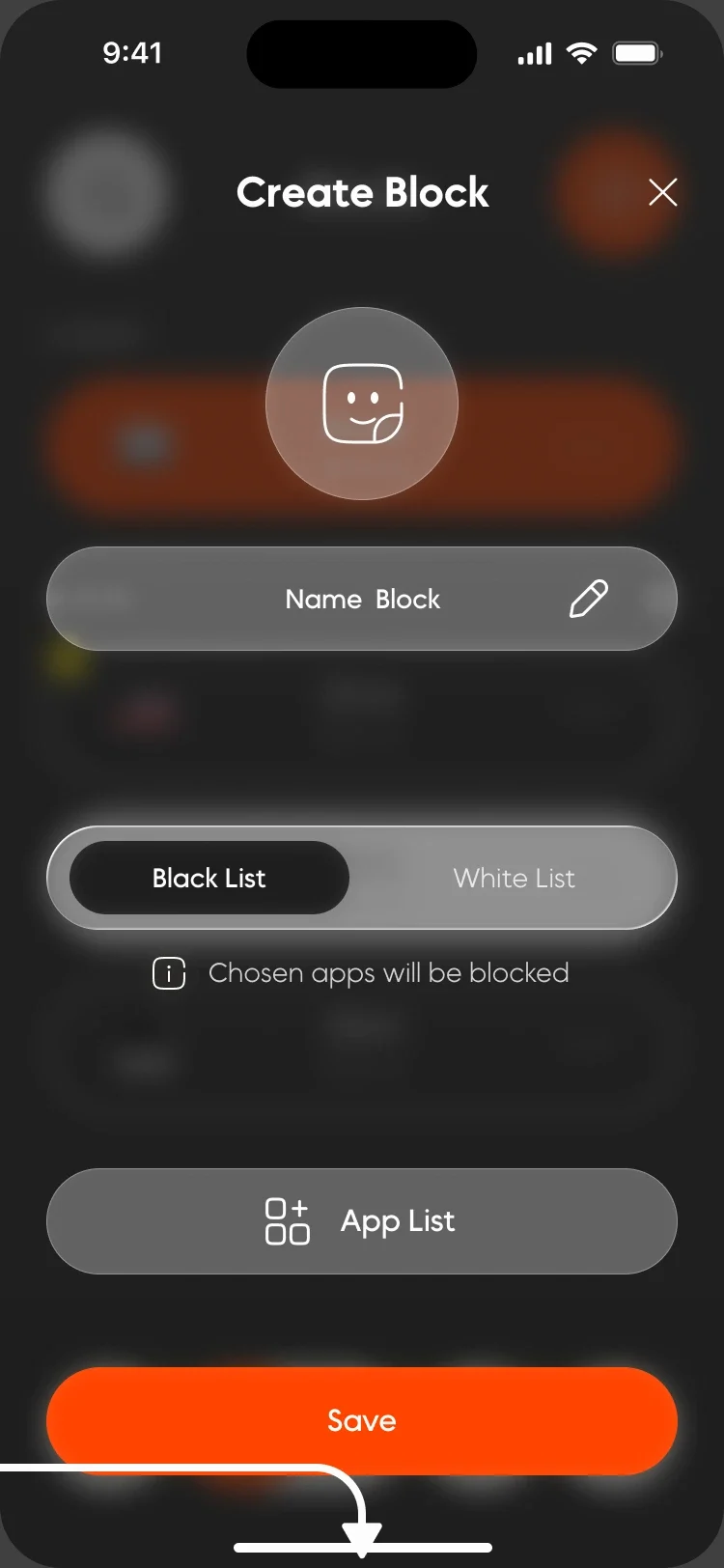
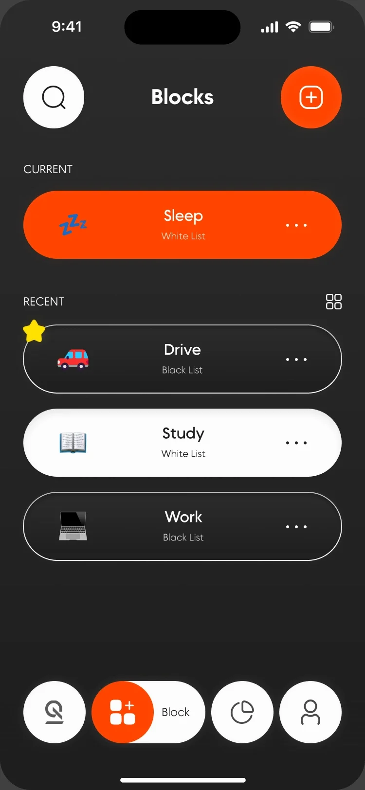
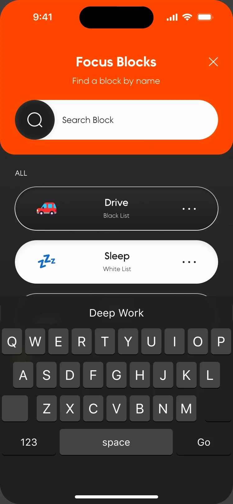
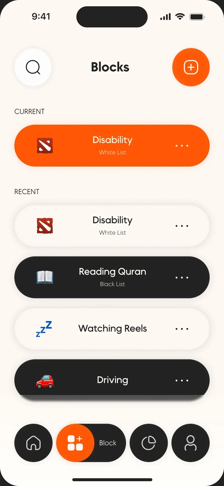
A block is a set of apps for one part of the day. Each one is a block list or an allow list.
The empty state starts the first block, and favourites keep the daily ones on top.
05 / Progress
Progress without shame. Streaks and focus hours reward the habit instead of counting the misses.

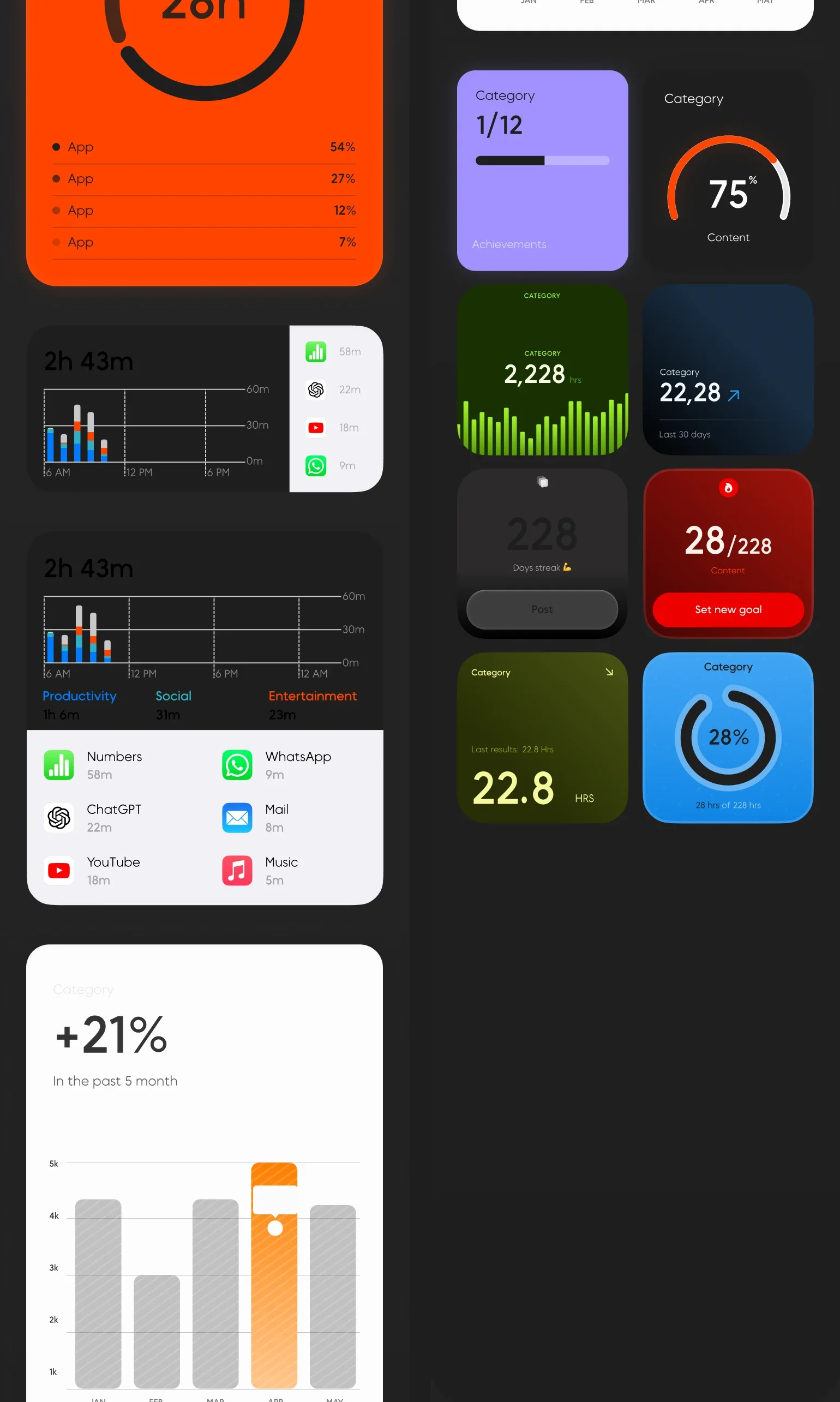
06 / Two themes
Dark by default, light for daytime. Every core screen ships in both.
07 / Design system
One orange carries every action. Each text pairing was checked for contrast.
- Primary#FF44003.40 on white
- Ground#1E1E1E16.39 AAA
- Surface#FDFDFDText on dark
- Highlight#FFE100Favourites
- Alert#EE0000Delete, unlock
- TypeMADE Okine Sans, one family across the app and the landing page
- Grid375 frame, 4 columns, 24 px margins and gutters, 8 px baseline
- ComponentsBlock pills, sheets, tab bar, timer, inputs and keyboards in both themes
08 / The rest of the app
Onboarding, sign in, account, help and language, designed to the same standard as the core loop.
01 / 10
Work with me
Planning an app and need UX/UI design? See UX/UI services.