Steadfast
Case studyProduct UI, 2026
Overview
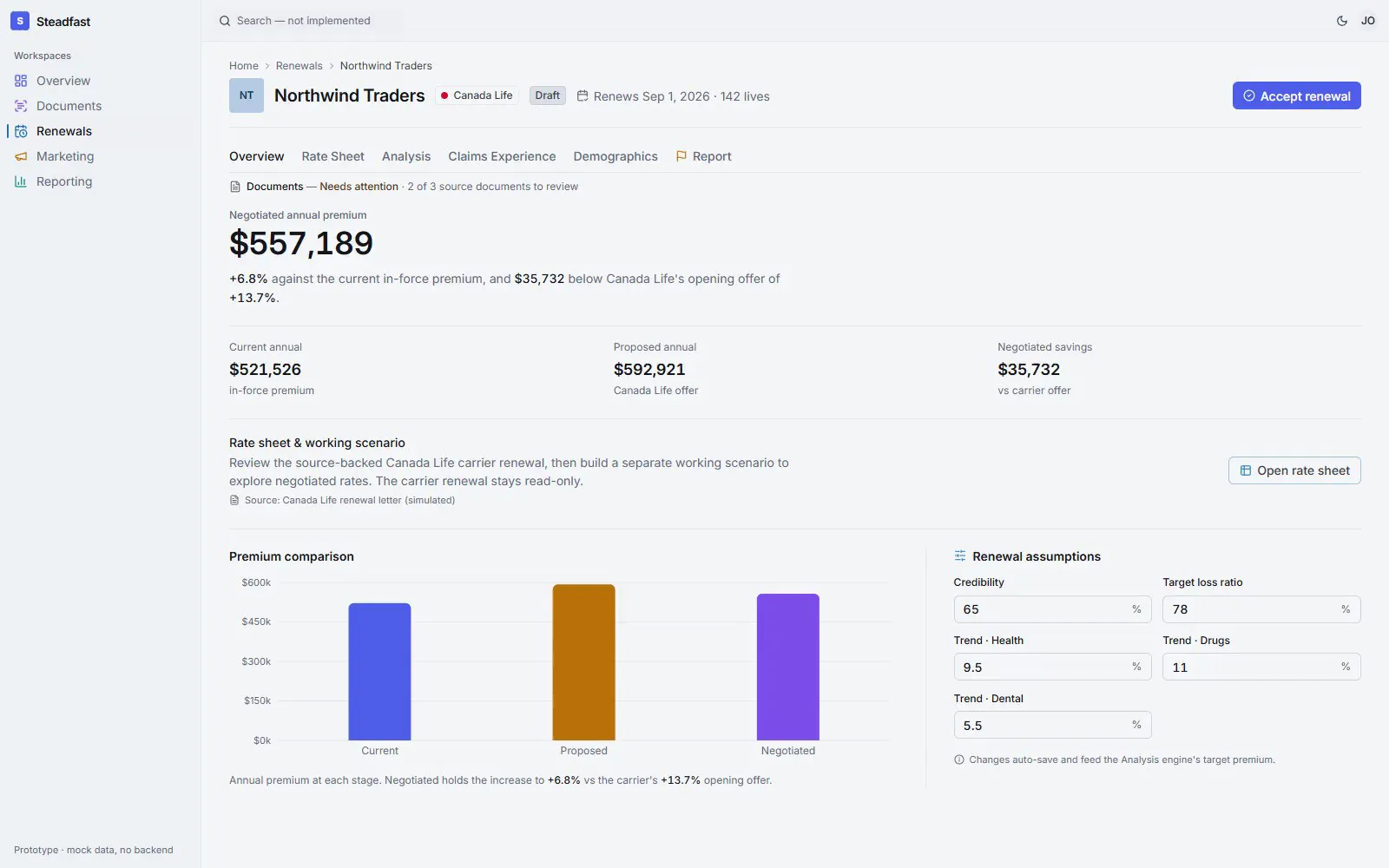
Benefits brokers spend their days retyping numbers from insurance PDFs. I built the front end where AI does the reading, and people can check every number it reads.
- ClientSteadfast, software for Canadian group benefits brokers
- My roleThe whole front end: flows, interface, components, accessibility, tests
- Worked withThe Steadfast product team and the Rails engineers at Vasdev Design
- StackNext.js 15, React 19, TypeScript, Tailwind, Radix UI, Vitest, Playwright
- 4Product areas, one source pattern
- 340Commits in two months
- 79Test files, unit to browser
- 40pxSmallest tap target on a phone
01 / Trust the number
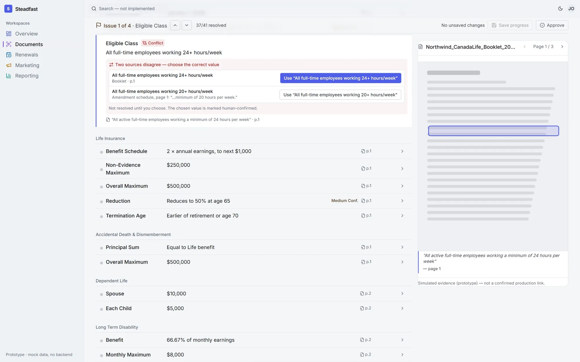
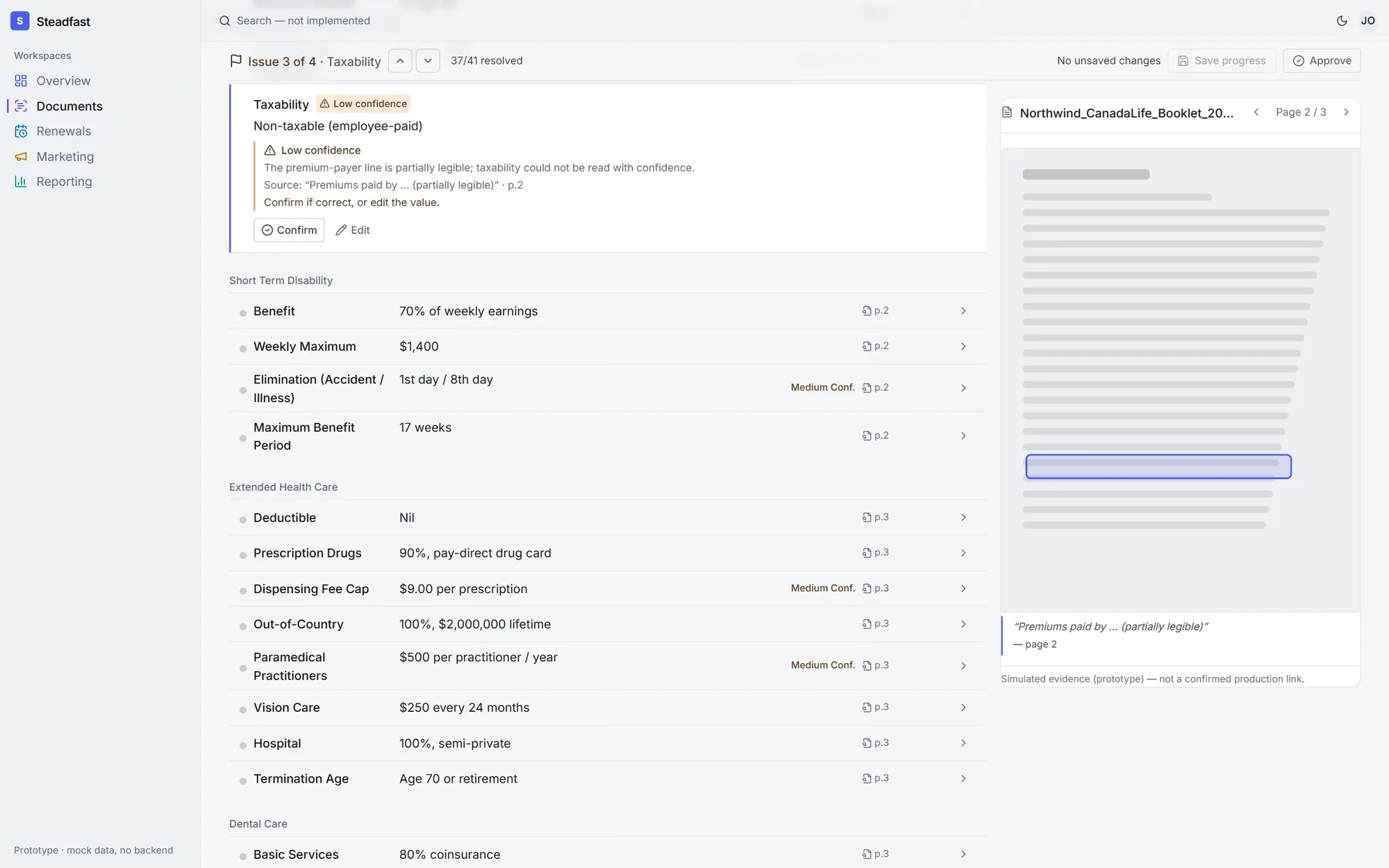
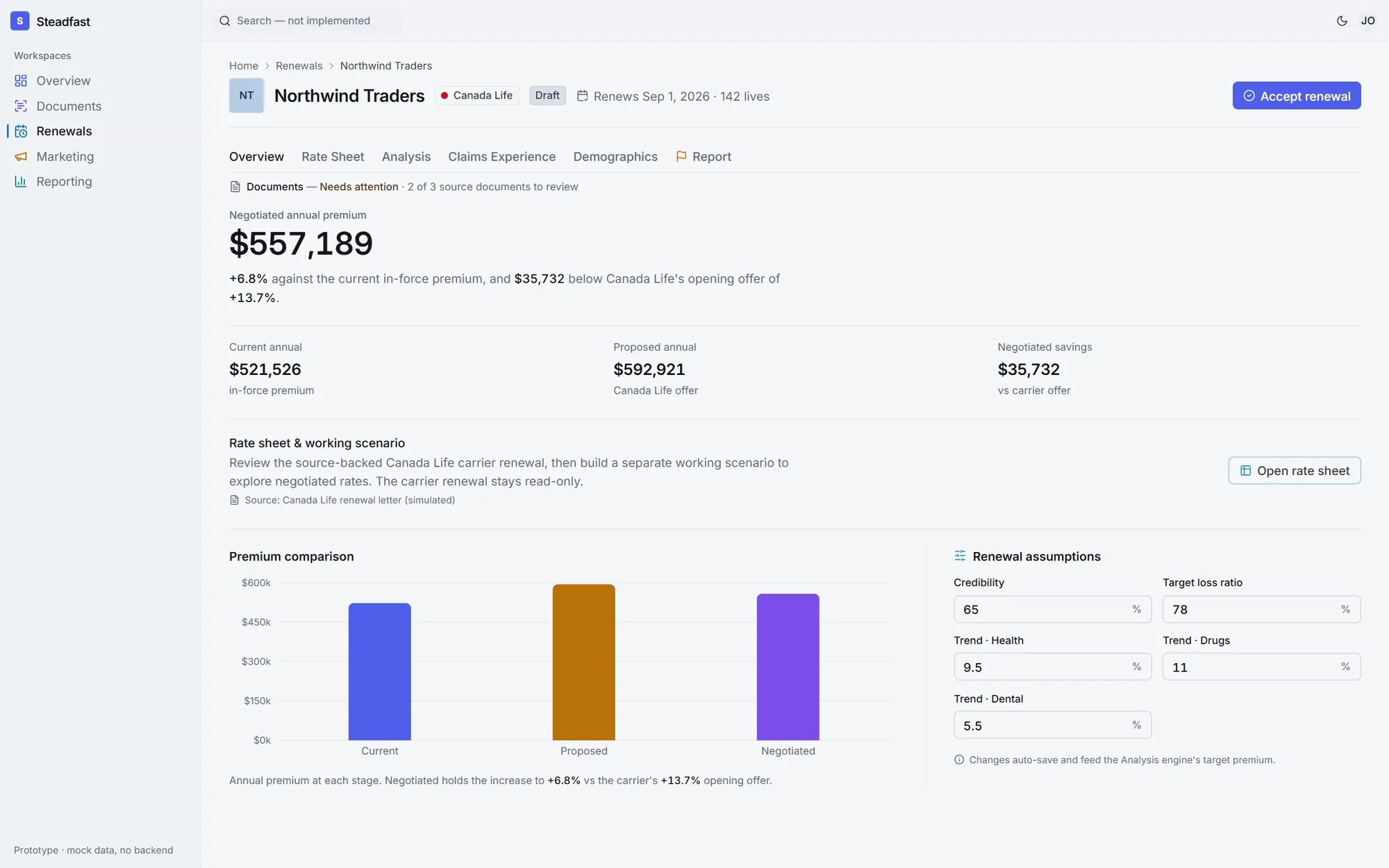
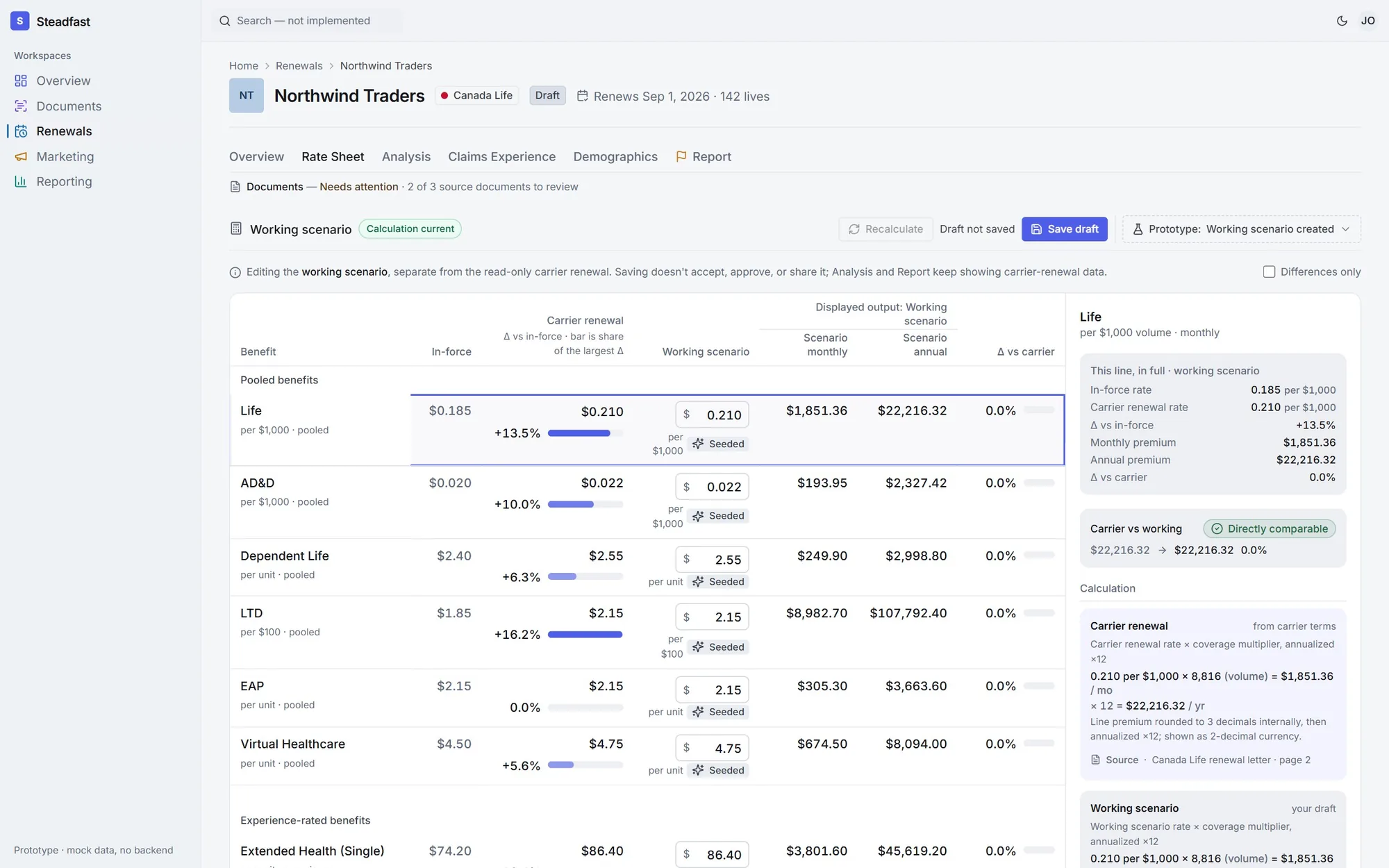
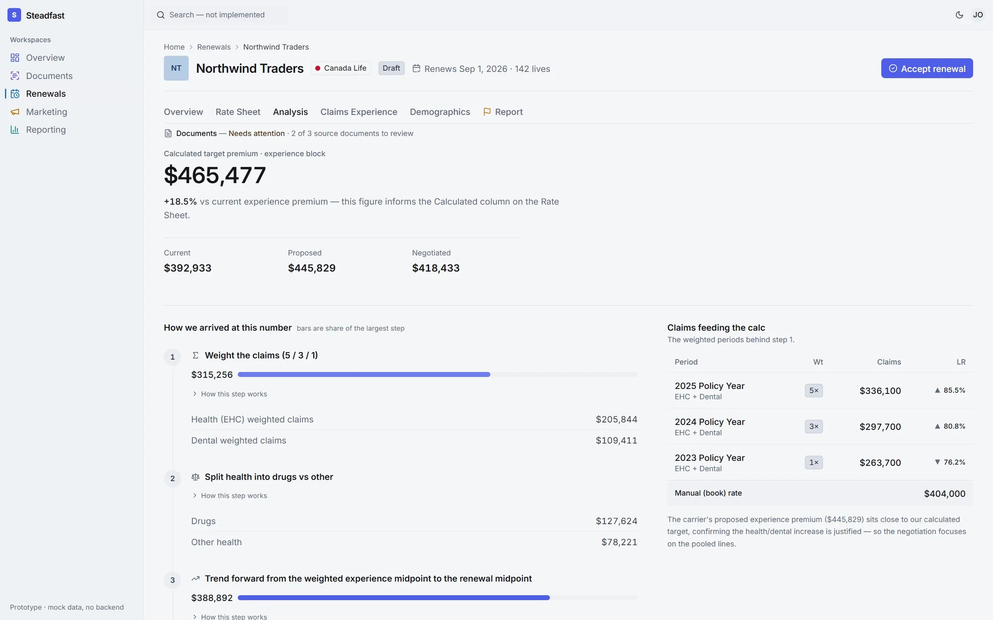
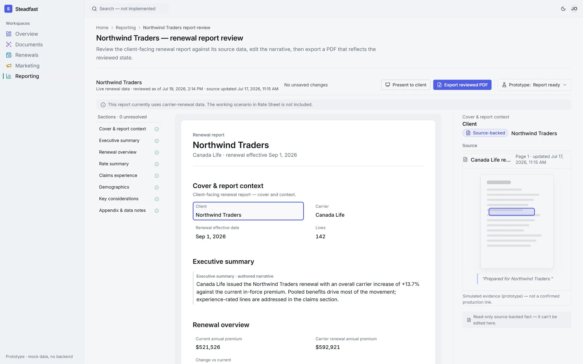
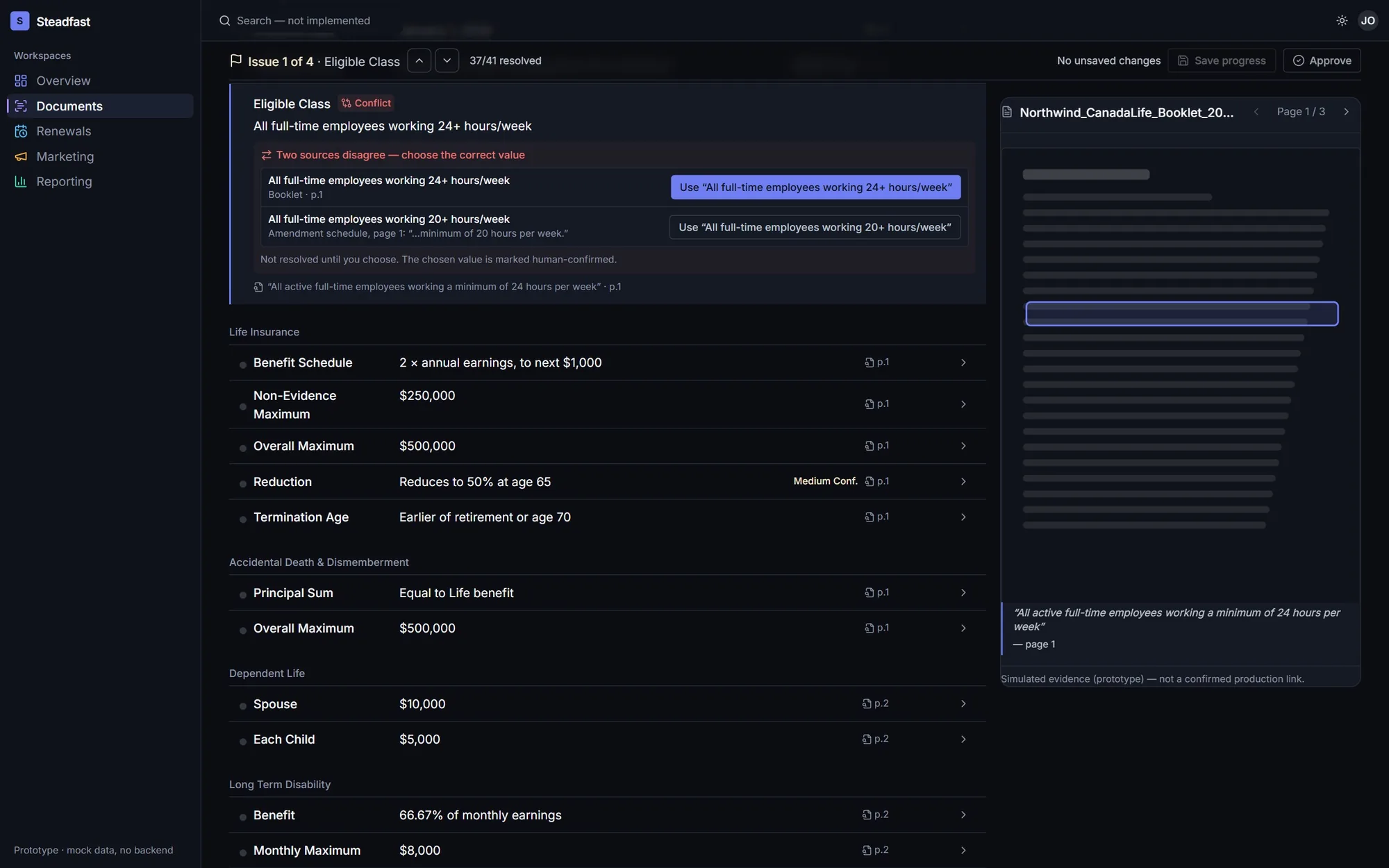
AI reads the carrier booklets. Every value it pulls out carries a confidence dot, the page it came from and the exact passage, one click away.
When two documents disagree, the screen says so and a person decides.
02 / Design the failures first
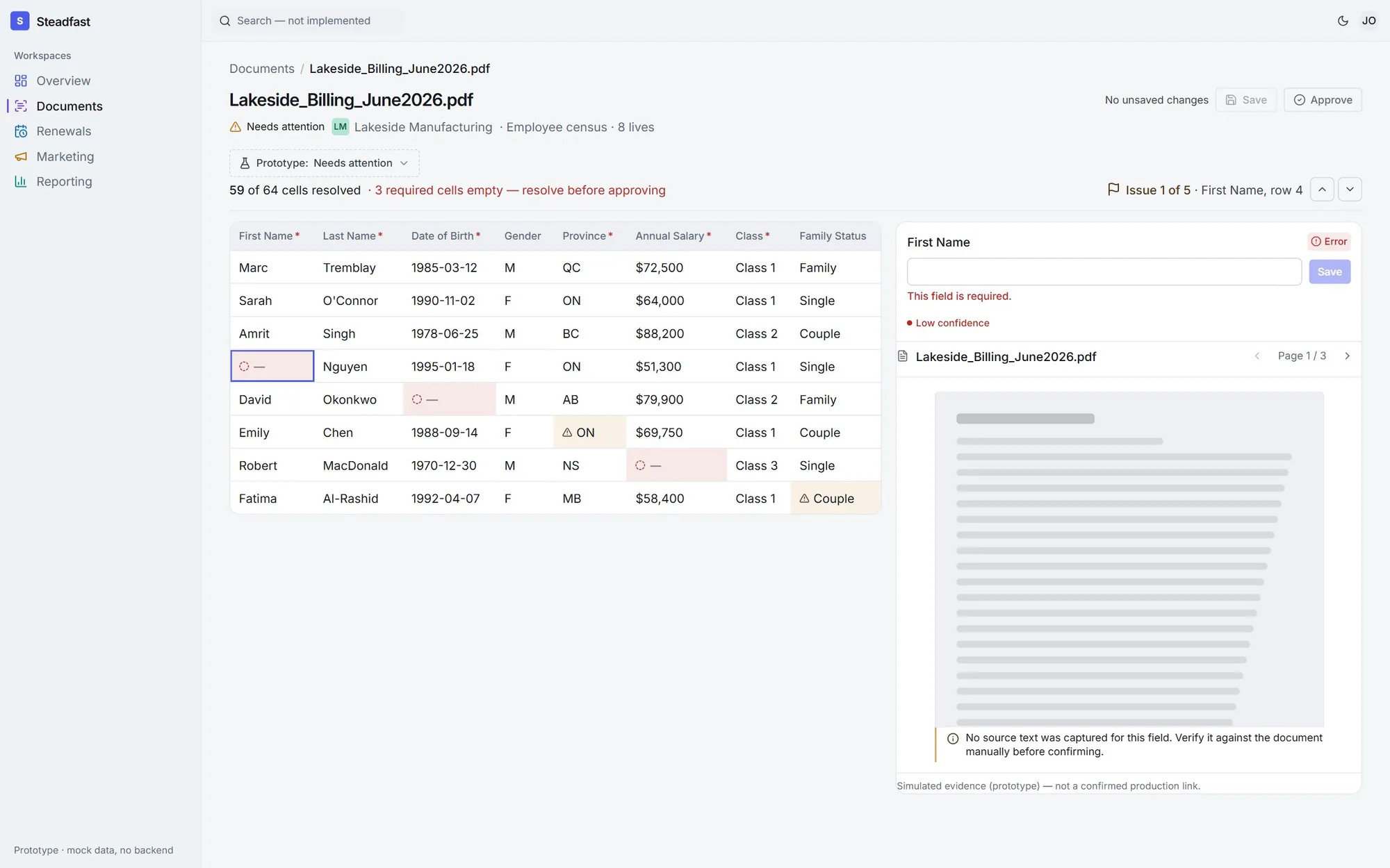
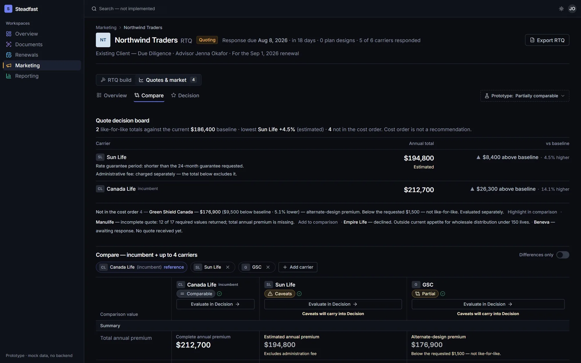
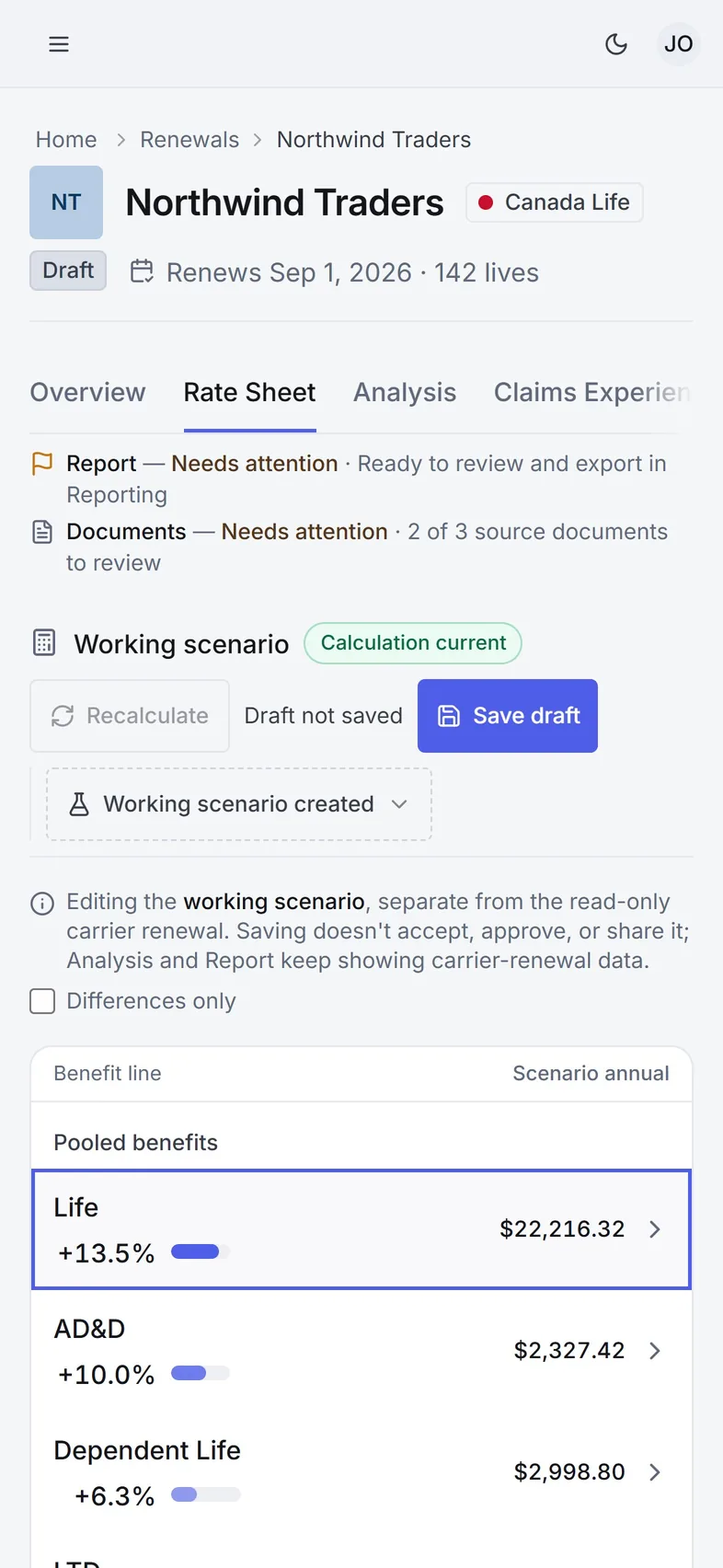
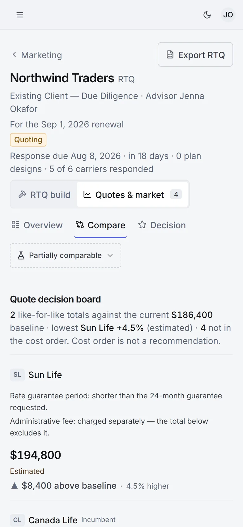
Low confidence, a missing rate, a failed save, a report whose source changed. Each edge state has its own link, so any demo can open it on cue.
01 / 08
03 / One group, start to finish
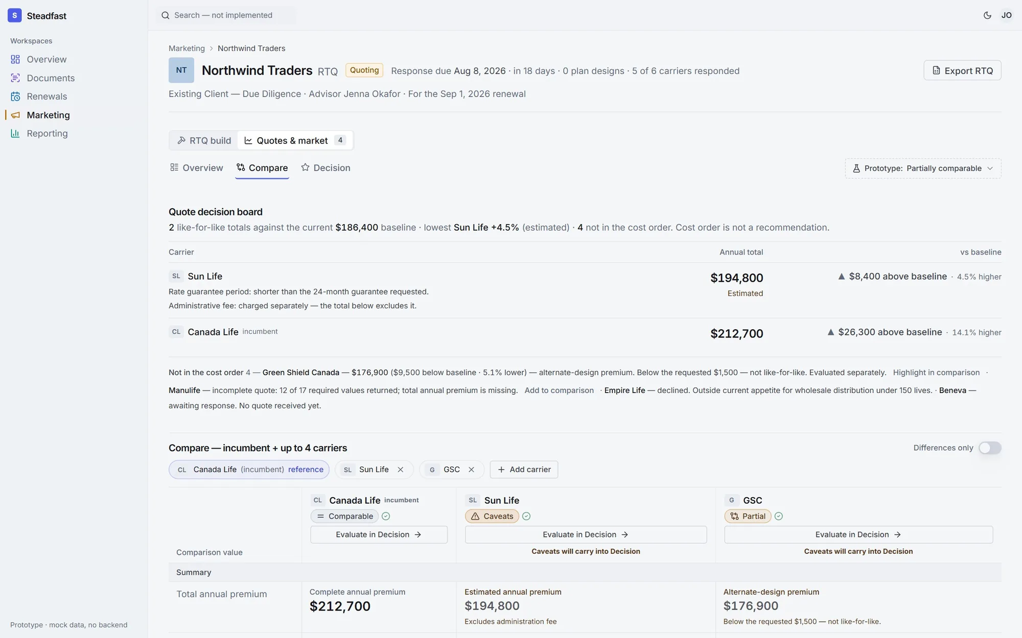
A guided demo follows one client, from the booklet upload to the renewal report they receive. Ten steps, every number traceable back to a page.
04 / Screen to paper
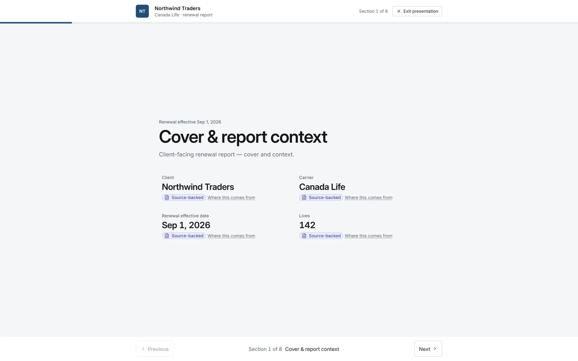
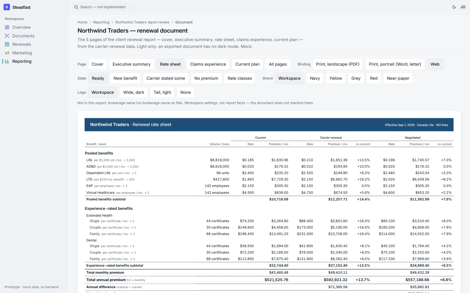
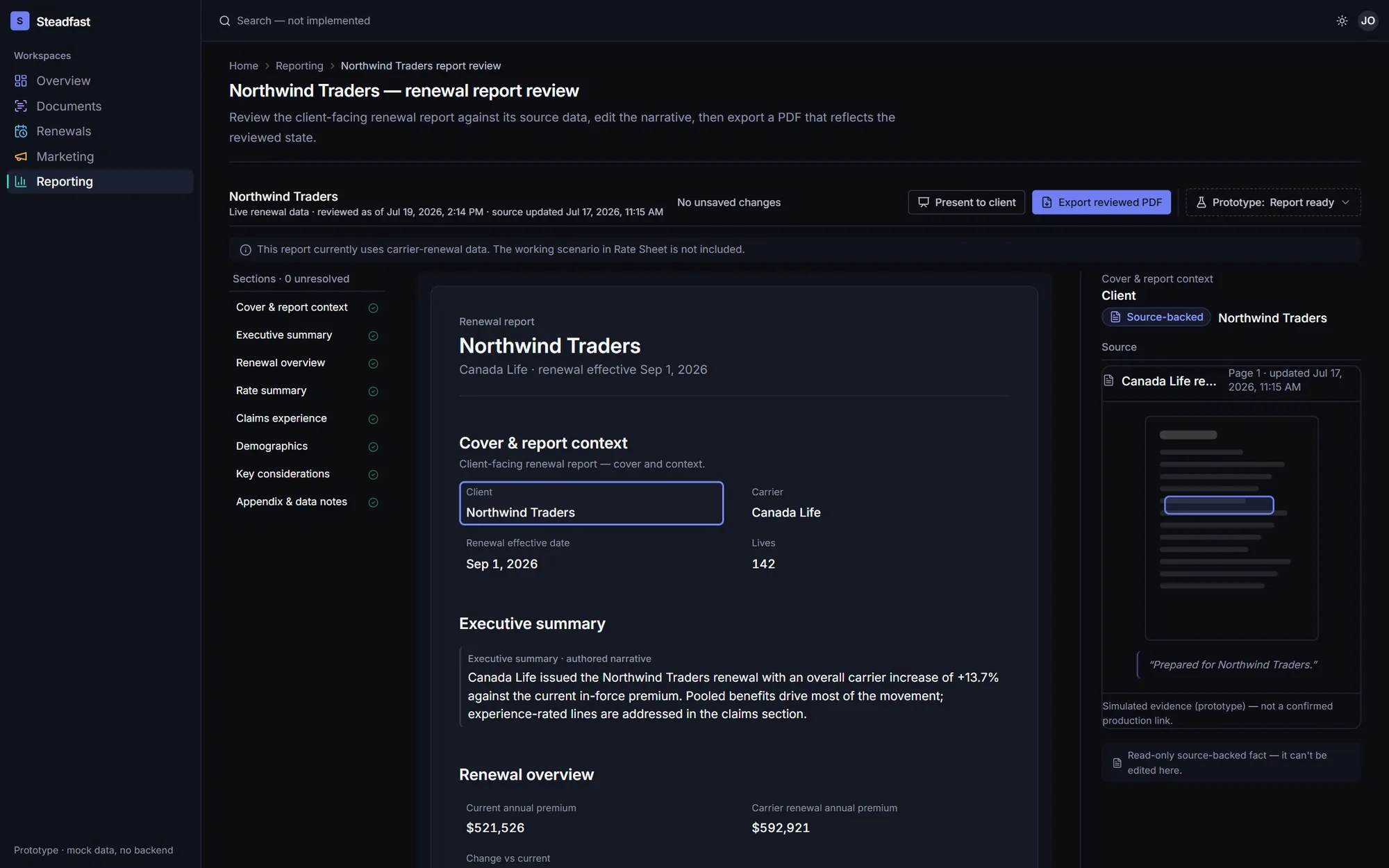
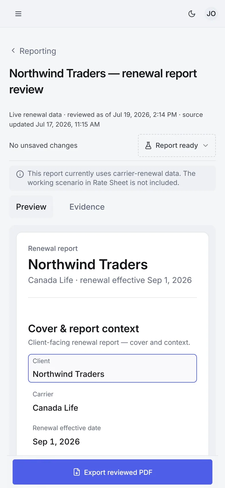
The renewal report reads the same on screen, in present mode and as a PDF. Page breaks and table widths were measured in the browser, not eyeballed.
05 / A skin that can change
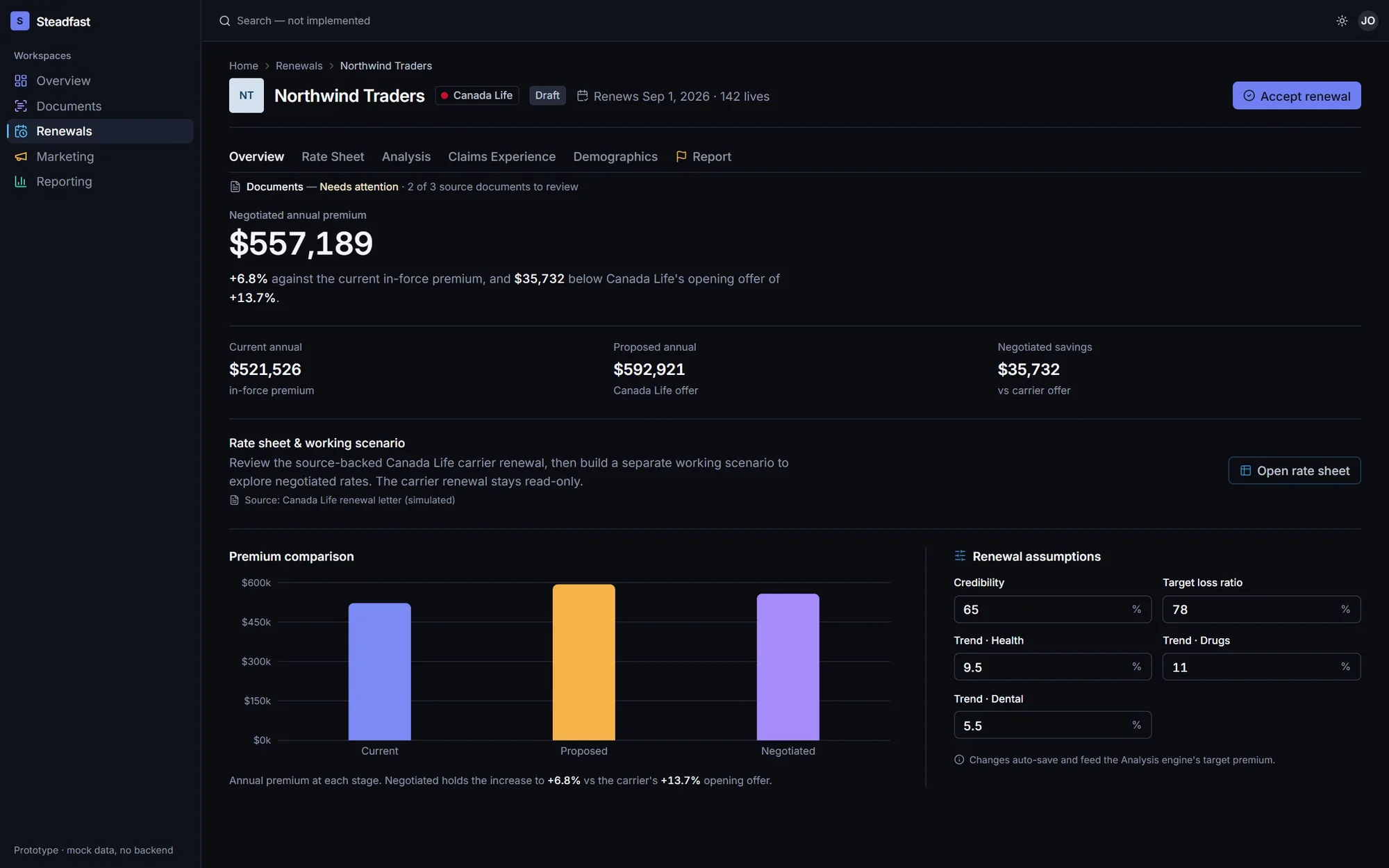
Built on design tokens, so the whole look can change without touching the flows. Dark mode passes the same contrast checks as light.
06 / Phone ready
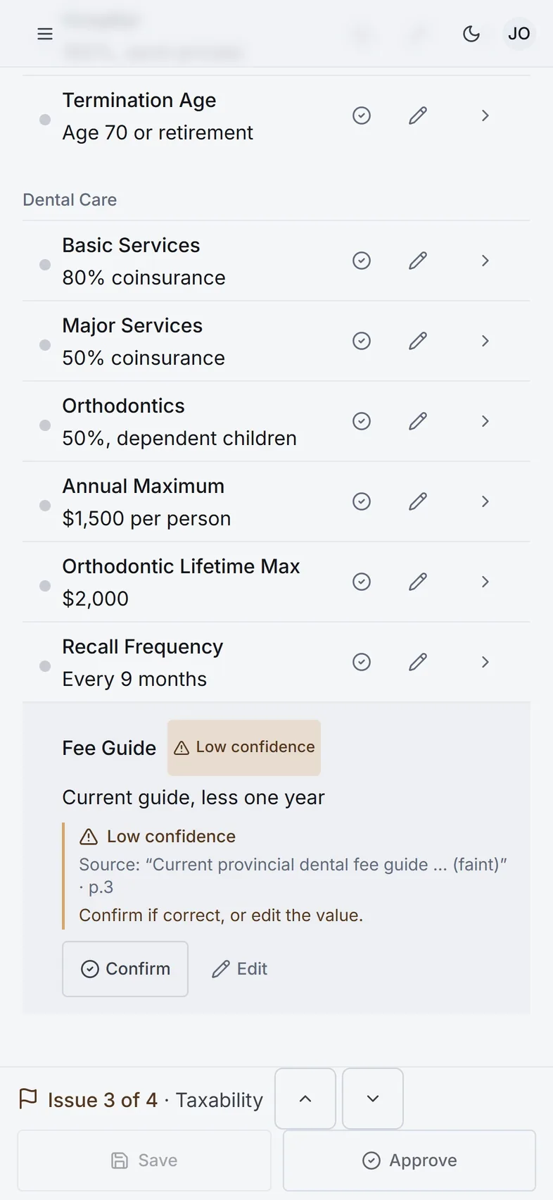
Every control measures at least 40 by 40 px on a phone, checked by a test in real Chromium at 390, 600 and 768 px.
07 / Under the hood
A standalone Next.js app on typed mock data, so the product could be designed and tested before the back end existed.
- FrameworkNext.js 15 App Router, React 19 and strict TypeScript.
- ComponentsHand-owned primitives on Radix UI, one source-value pattern reused across every area.
- StateEvery screen state lives in the URL, so a refresh or a shared link opens the same view.
- Accessibilityaxe audits, WCAG 2.5.8 target sizes, 3:1 contrast for every chart colour.
- Quality79 test files: units, components and browser probes for layout, print and reach.